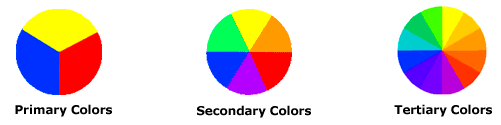
1.0
Introduction
2.0
Types
of Visual Elements in Graphic Design
2.1 Point
2.1.1 Reason of point used in
graphic design
2.2 Line
2.2.1 Reason of line used in
graphic design
2.2.2 Types of lines.
2.3 Shape
2.3.1
Types of Shapes
2.4 Space
2.4.1 Positive and Negative Space
2.4.2 Two and Three Dimensional Space
2.5 Movement
2.5.1
Movement element in various Artworks
2.5.2 Static and Dynamic
movement
2.6 Texture
3.0 Conclusion
References
1.0 Introduction
To design a graphic image, it is
important to incorporate various kinds of visual elements to the particular
image such as posters, banners, advertisements, billboards and so on in order
to create an image which can represent a situation and at the same time deliver
some key points or messages to viewer about situation. Each of these visual
elements plays their own role in indicating some signs or delivering some
implicit messages to the viewer. The types of visual elements used in graphic
design are point, line, form and shape, movement, space, pattern and texture;
these elements has been applied in advertisements, painting of pictures,
packaging of manufactured products, book covering, gift wrappers and so on.
These
elements has become so useful to people because they are not only used in
attracting them, but they are also used in creating awareness to them by
highlighting or promoting important issues or events. For example, when the
members of Ministry of Health are worried about the widespread of dengue fever,
they will display banners to create awareness to people so that they will take
precautions. These kinds of banners contain some of the visual elements that
are combined to create distinct typefaces and various kinds of colours and
shapes, which suits with the intended theme. Another example is displaying
banners of the important of blood donation. One of the most important about the
uses of visual elements is in the teaching and learning process in
kindergarten, schools (primary and secondary), colleges and universities. Since
the advancement of digital imaging, visual elements have been widely used to
create slideshows for teachers and lecturers to teach their students so that it
will be easy for them to grasp or understand about what they are learning in
their class and at the same time it will avoid them from getting bored.
Slideshows are also used in presentations not at schools and colleges, but they
are also used in corporate or business sectors where the presenter will explain
the content in the slides with the assistance of the elements that have been
used to create the slides.
One
important aspect in creating any kind of slideshows is the clarity; if the
elements are used according to the suitability of the background, foreground
and words, then the viewers will be able to have a good clarity of the slides.
The following topics in this discussion will explain more detail about the visual
elements.
2.0 Types of Visual
Elements in Graphic Images
As
we know that there are numerous types of visual elements in graphic design such
as below:-
1.
Point
2.
Line
3.
Shape
4.
Space
5.
Movement
6.
Texture
2.1 Point
A point which is also known as mark is one
of the basic element in graphic design. This element is used in designing many
kinds of images including digital images. It is used to create a focal point
for a viewer; the focal point indicates the important part of an image. For
example, when a person sees dotted marks on a blank paper, his or her mind will
automatically provides the connections of the marks that form shapes or lines
on the blank paper and when it does, this kind of phenomena is called grouping.
2.1.1 Reason of Point being used as a Visual
Element
There are reasons for using point in
designing attracting and meaningful images. Point is used for emphasizing the
important part of a picture and the part that is emphasized is known as a focal
point. It draws attention of the viewer that makes him or her to observe the
focal point. Figure 1 shows the bull’s eye where the innermost point serves as
the focal point for the viewer.
Figure 1. Innermost point in the
bull’s eye serves as a focal point
Figure 2 shows another picture about dotted
marks forming an arrow. As the marks get closer together, they will form the
arrow which looks more apparent than being distant from each other.
Figure 2.
Dotted marks gets closer to form an arrow
Points can also be used in painting to create
magnificent and creative images. Notice that Figure 3 shows points are used to
design the picture of a man and each of the points has its own colour, this
kind of painting is called pointillism.
Figure
3. Pointilism method is used in artwork
2.2 Line
Line is defined as individual points or marks
are grouped together to form various kind of lines. In field of arts, line is
used for indicating or signifying an emotion or state; an artist may use a line
in his artwork for many purposes such as drawing it in two directions which is
in vertical or horizontal directions. Both the directions may represent some
psychological state or feeling and it can also point to some directions which
can be used to direct the focal point.
2.2.1 Reason of line being used as a Visual
Element
In many images, there
are lines being drawn upon them for some reasons. For example, a line which is
drawn upon a product label is to highlight the consumer about the nutrition
facts of the product. Figure 4 shows an example of line being used in a product
label.
Figure 4.
Lines used for creating partitions in table
Notice that there are three different lines
on the label; from the thinnest to the thickest. The reason these three lines
are used is to create partitions in order to separate the different parts of
the fact but they remained in the same table. This makes easier for the
consumer to understand when he or she reads it. There is another example of
using lines in images, lines which can represent of a moving object. For example,
an artist draws a picture of a waterfall; the lines is very useful for the
artist when he or she drawing the flow of the water in the picture. Refer
Figure 5 below.
Figure 5. Lines used for drawing waterfall
Figure 6 shows that lines are also used to
draw water waves
Figure 6. Curving lines used for
drawing water waves
Furthermore, lines can also help in pointing the vanishing point in an
image. In some images, the viewer can identify the vanishing point by referring
to the objects that indicate the path that disappears. These objects can be a
building, road, railway, paddy field, desert or anything that it is in the form
of a horizontal line. This line actually directs the vanishing point in a
picture. To have a better understanding, Figure 7 and 8 show images of a
vanishing point.
Figure
7. Vanishing Point
The image above shows that the field and
road actually pointing at the path that disappears. The reason is both the
field and the road are in the form of a horizontal line which actually
responsible for creating the narrow path.
Figure 8. The path that begin to vanish
from the passage
The picture above shows
another image of a vanishing point. In the picture, it shows that a passage
that leads to the path which almost difficult to be seen. When a viewer looks
at the picture, he or she will realize that the objects in the horizontal
position shows the direction of the narrow path and at the same time it can be
presume as a focal point. The same picture below shows red lines have been
drawn to show the direction of the path and the focal point which makes the
viewer to focus on that particular point. The focal point in Figure 8 is the
passage to another dimension of the premise.
Figure 9. Red lines
that points the vanishing point and focal point
2.2.2 Type of lines
Basically, there are five types of lines
namely; vertical, horizontal and diagonal. A vertical line signifies spirituality
or strength. Figure 10 below shows an example of an object in a vertical
position. A building in a vertical position tends to attract people due to its
height.
Figure 10.
Pillars (objects) in a vertical position
A horizontal line indicates the feeling of
rest and peace. An example of a building in a horizontal position is shown in
Figure 11.
Figure 11. A building in a horizontal position
A diagonal line indicates the movement of an
object both it’s about to fall or in motion, this kind of line represents
instability. Refer to the Figure 12 and 13 below.
Figure
12. A group of dancers in motion
Figure
13. Pears are instable position
2.3 Shape
Shape is another type
of visual element and it is also one of the most basic elements that is used for
illustrations, particularly in graphics. There are categories of shapes,
organic and inorganic. Any shapes that can be seen in any images, usually has a
closed line. The following topics below will explain about the various type of
shapes both for organic and inorganic and pictures are also available to
provide clarifications.
2.3.1
Types of Shapes
Inorganic
In organic shapes are also known as
geometric shapes such as triangle, rectangle, circle, oval, hexagon, pentagon
and etc. In architecture, these shapes are used by architects in designing
buildings. Some of the buildings in geometric shapes are pyramids, The Pentagon
and The Sydney Opera House.
Figure 14. The pyramid having four
sides of triangles
Figure 15. The Sydney Opera House in
Australia has triangle shapes form on its roof.
Figure 16. The Pentagon in Virginia, USA
indeed has the shape of a pentagon.
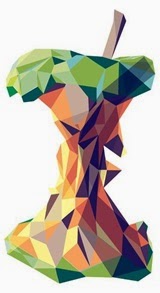
Inorganic is also used in arts; the pictures
below show that shapes were used in illustrating objects. The picture of a
bitten apple has several shapes such as square, triangle and pentagon. The
shapes which is used has their own colour.
Figure 17. A bitten
apple image is digitally designed with various colourful shapes
Figure 18 shows a
fox is also illustrated by combining several inorganic shapes, each with their
own colour.
Figure 18. A picture of a fox digitally designed with various
colourful shapes
Organic
Organic shapes are different from inorganic shapes because
they occurred naturally. Typically, organic shapes has curving and flowing
appearance. Figure 19 and 20 below shows
organic shapes used in art.
Figure 19. Curving lines
used to create organic shapes
Figure 20. Combination of colourful
organic shapes
Shapes
can also be found in tangible objects such as sea shell, leaf, flowers and so
on. Refer to Figure 21, 22, 23 and 24 below.
2.4 Space
Space is described as the distance between
two objects or the empty area by an object. It explains how an object forms a
shape in the unoccupied area. Space comes in 2 and 3 dimensions. This visual element can be positive or
negative. Usually, the positive is white or bright and the negative is black or
dark.
2.4.1 Positive and Negative Space
A positive space is the
shape of an object and it is the main focus in a picture and a negative space
refers to the shape that form in the unoccupied area surrounded by an object,
it actually creates an illusion for the viewer. Below shows the pictures of
positive and negative space, where an object (positive space) forms a shape
(negative space).
Figure 24 below shows that a picture of a
vase (bright) which is a positive space and the background shows silhouettes of
two human beings (dark), which it is a negative space.
Figure
24. Positive and negative spaces
2.4.2
Two and Three Dimensional Space
Two-Dimensional
Space
A two-dimensional space picture is usually
looks flat, which means it can be only viewed at one side of an object in the
picture. This image (object) consists of width and height. Figure 25 below
shows an example of two-dimensional picture; it shows that the image of a duck
seems to look flat and there is no overlapping because the duck is the only
object in the picture otherwise it will look like a three-dimensional space
picture.
Figure 25. Two-Dimensional Space
Three-Dimensional
Space
A three-dimensional space picture usually
looks like as if the object is tangible due the presence of other objects; this
kind of artwork has three dimensions which are width, height and depth. For
example, imagine a picture of round shapes overlaps to each other or imagine a
picture of two objects where one seems to look smaller than the other; it makes
the person who is looking at the picture feels that the object which looks
smaller seems to be far away and bigger one seems to be nearer. Refer to Figure
26 and 27 below.
Figure
26. Objects far apart creates depth
Figure 27. Round shapes overlapping each
other
2.5 Movement
Movement also known as motion is the process
of changing position of an object. In the field of arts, this element is
actually the representation of motion that generates the feeling of a person.
This means when a person views a painting of birds flying, he or she can
imagine the movement and at the same time he or she can sense the feeling of
flying.
2.5.1 Movement element in various Artworks
Movement element can be actual or it can also
be an indication; if a picture of a person walking has been captured it is
called an actual movement and if an artist draws or paints a picture of a
leopard running is called an indication. Refer Figure 28 and 29 below.
Figure 28 Photograph of a person walking
been captured
 Figure 29 Picture of
a leopard running
Figure 29 Picture of
a leopard running
Apart from living things, movement can also
be used in typography. It is a creative idea in using designing typography to
represent movement. To design a typeface that represents a movement the typeface
should be in a diagonal position, indicating that it is creating a movement.
For example, refer to Figure 30 below.
 Figure 30. Words in diagonal position creates movement
Furthermore, this
element can be helpful in artwork pertaining to fluid movement. One good
example is painting or drawing water waves of seas and oceans; this kind of
artwork is associated with another element called lines. Refer to Figure 31 below.
Figure 31. Using
lines to draw water waves creates movement
2.6 Texture
Texture is one of the visual
elements which refers to the quality of a surface that can be sensed through
touch or just by seeing and imagining it through thoughts. The quality of a
surface refers to its physical characteristics such as soft, rough, smooth,
wet, silky and etc. Texture has two types which are real or tactile and visual.
The following topic will explain about them both.
2.6.1 Types of texture
Real/Tactile
Real or tactile texture refers to the
feeling of a surface by touching it by using hand instead of feeling it by
visualizing. It means that a person can sense the surface of a tangible object
by actually touching it. Figure 32 shows that a person is touching a tree to
feel the texture of it surface; by touching the tree will enable the person to
sense the exact texture of it. Tactile texture is also referred to man-made
material; these materials could be made of clay, metals such as bronze, silver,
gold and etc; plastic and etc. Figure 32 and 33 shows the picture of sculptured horses where, in Figure 32 is a
picture of a sculpture wooden horse and Figure 33 is a picture of a sculpture
aluminium horse which was sculptured by Deborah Butterfield .
The design of both the sculpture are the same but the texture is different due
to the materials were used for creating them.
Figure 32. Deborah Butterfield Woodrow
Figure 33. Deborah
Butterfield Aluminum Horse
Figure 34. A person
touching a tree to feel its texture
Visual
Visual texture refers to the
surface which is painted or drawn by an artist as a real texture and the
advantages of this kind of texture are; the colour of a texture can be changed
and if texts are created by using textures, the font such as size and spacing
can also be changed. The term “visual” applied for this texture means that it
can be sensed by imagining it. For example, if an artist painted a picture of a
wet glass and if a viewer sees it, he or she will instantly feel the wet
texture through his or her mind. This is due to the experience of the viewer
has gone through before when touching a wet object; so he or she will easily
recall back that memory. Figure 33 shows a wet paint artwork, by looking at the
picture the viewer will be able to feel the sense of wet and chillness due the
combination of bright and dark contrast of the blue colour.
Figure 35 Wet painting that creates
an illusion of feeling wet and cold
Conclusion
After conducting the study of the use of visual elements, the author
learned that the visual elements which has been studied has link to each other;
the author found that many complex artworks are produced by combining many
different kinds of visual elements. For example, when an artist is painting a
picture of a waterfall he or she will use some of the visual elements such as colour, line,
movement and texture to ensure that the picture looks as it how it has to be,
its clarity should look obvious and of course it has to look attractive when
anyone views it. The author felt that a picture could be analyzed by relating
to the visual elements in order to conduct a thorough study upon it because the
elements are the foundation or the fundamental of an artwork. Furthermore, the
author realize that graphics and animation designers can be presumed as artists
because they come up with the same pattern of creativity and using the elements
as conventional artists do.
In addition, the author has come up with
the decision of using some of the six elements for the Milo Rebranding Project.
The elements are shapes, movements and lines; the reason is to be that shapes
can be used for highlighting some of the new trend such as additional flavor to
the beverage introduced or to highlight to consumers about the nutrition of the
beverage has been improved. Movements can be used for illustrating some
characters being very dynamic; for example, a character in a human form running
for victory can be illustrated. The reason for selecting this element because
Milo is meant to provide energy to the person in completing tasks, so movement
can represent a person for being energetic and dynamic. Finally, lines can be
useful in creating shapes and it can also act as a tool in providing balance
when designing the similar typeface of the Milo logo.
References