Introduction
In graphic design,
color is an important element. It brings out the “life” of the design and makes
the appearance of the design more appealing. It also helps the design to convey
its message in a more direct way. But color is not just the general red, blue,
green, etc. It has a much deeper meaning, which will support the design other
than conveying messages and attracting attentions.
In general, we know
that color helps to represent the objects concerned, for instance, apples are
red, and grass is green. This is what we are taught, but not what only should
be taught. Color and its nature and impact can greatly contribute to graphic
designs in many more ways other than identification.
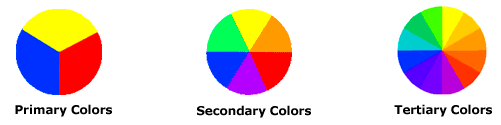
The Tiers of Color
Here are some simple
and general information of color to ease the upcoming explanation of the nature
of color.
Primary
Colors: Red, Blue, Yellow
Theoretically,
primary colors are the colors that can’t be mixed by other colors. They are the
basic colors.
Secondary
Colors: Purple, Orange, Green
These colors are
formed when mixing the primary colors.
Tertiary
Colors: Red-purple, Red-orange, Blue-purple, Blue green, Yellow-orange, Yellow green
These colors are
formed when mixing the primary colors with the corresponding secondary colors.
The Flavors of Color
Each color has its
own nature, flavor, properties. They are distinguished by their very own unique
properties.
Red is the most
eye-catching color. It symbolizes energy, passion, extremes, hotness, etc. In
different perspective, red has different meanings. Red can represent anger and
danger. But it may also symbolize wealth and prosperity.
Blue is our favorite
color. It is the color of the sea and sky. It is the color of peace and calmness.
It also represents loyalty, trust and it’s the color of professionals. It
carries out dependability, as shown in some studies.
Green is the color of
nature. It has soothing and healing effects. Green color is able to relieve
stress because of its connection with nature. It may also represent new life,
or new beginning.
Yellow is the color
of luminosity, and it is often used in car headlights. It is associated with
happiness, sunshine, and enlightenment. It is the most optimistic color. It
catches our attentions well, thus it’s also used as the color of caution.
Orange is the color
of fun. It represents joy, pleasure, and healthy. It is often used as the theme
color for adventures, as it brings out the adventurers in us. Orange is also
considered a friendly color, making it fitting into most of the designs.
Purple is always
considered as the mysterious color. This is because purple is used in such way
that we are fascinated but somehow puzzled by it. Purple is also the color of
supernatural. It gives us the eerie feel but keeps us amazed at the same time.
Pink is a sweet
color. It creates a soothing and pleasing atmosphere. It is known as the color
of romance. It supports the theme, and enhances the atmosphere. It is also
considered as the color of girls, and pink stuffs are usually considered as
girls’ stuffs.
The strongest of them
all, black is one of the most famous colors. Black represents power, elegance,
and high quality. It also symbolizes formality, which is why it is widely used
in formal occasions.
White is considered
the color of elegance, similar to black. It is the color of purity, and
simplicity. It also represents innocence, because it’s bright and free from
influence of other colors. White somehow symbolizes emptiness, and is usually
used with other colors in order to enhance the contrast of the colors.
Each color has its
own symbolic meaning, and this will give designers and edge if they can
understand and manipulate the colors well.
The Impacts of Color
The main impact of
color is the impact on our visual. As soon as we see it, colors will be
interpreted by our brains. Color is also able to affect our visual in another
way. For instance, color can affect our vision of other objects like words.
Different combination of colors will affect the image received by our retinas,
and the output of the brain will also be affected, as well as the clarity of
the message.
Color
will create a secondary impact, which is usually related to the things of the
correspondent color. Thus when our brain receive the vision of the color, we
will be indirectly prompted to imagine the nature of the color and attach it to
the sightings that we saw. For example, fire is generally considered to be in
red color. The moment we saw some red color objects, there is a hidden feeling
or thought of hot within our minds. Green color is usually associated to the
Mother Nature. Which is why the green color is go-green related, and is widely
used in such aspects.
Besides that, color
will cause impacts to our minds, emotional and psychological impacts. It is
scientifically shown that color is able to somehow manipulate our emotion and
alter it according to the nature of the color itself. Color is able to make a
happy person dull and a dull person happy. After our brains interpret the color
that we saw, there will be emotional feelings indirectly produced. For instance,
black color often produces seriousness, as it’s the color of formality. Green
color, on the other hand, produces relaxing feelings, as it’s the color of
nature. Pink color produces the feeling of love, and further emphasizes the
atmosphere of love and romance. These are all psychological emotions created by
our brains due to the impact of color. This also invoked studies of color and
stuffs like color therapies were invented.
In the process of
graphic design, color will largely affect the outcome of the design, and it’s
important to have the right coloring of the design. Different color will
generate different atmosphere. Optimum results can be obtained if the color of
the design matches perfectly with the theme and the atmosphere needed.
Conclusion
Studying color will
greatly contribute to the process of graphic design. This is because each color
has its own flavor, its own identity. Each color will create different effects,
depending on how it is used. How the color is used, and how well it is used, is
up to the designers. Different designers have different perspective, and
different preferences. Designs can be attractive as well as disturbing,
depending on the color used. With great skills, a designer can manipulate the
color at his or her will, and indirectly manipulates the audience with the
color used.
Color can be
considered as the decision point whether a design is good or bad. A design with
good color is able to easily attract attentions, and easily influence the
audience. Designs with poor color are considered “lifeless”, and are often
ignored or rejected by the audience. With good skills, a designer can excel in
the designing process, and come out with designs that are sure to captivate
others.
References
1. Color
Matter. 2014. Basic Color Theory. [online]
Available at: http://www.colormatters.com/color-and-design/basic-color-theory
[Accessed: 22 Feb 2014].
2.Color
Matter. 2014. The Meaning of Colors.
[online] Available at: http://www.colormatters.com/color-symbolism/the-meanings-of-colors
[Accessed: 22 Feb 2014].
3.Black
Bear Design. 2013. Understanding Color
& The Meaning of Color. [online] Available at: http://www.blackbeardesign.com/understanding-color-the-meaning-of-color/
[Accessed: 22 Feb 2014].
4.Smashing
Magazine. 2014. Color Theory for
Designers, Part 1: The Meaning of Color. [online] Available at: http://www.smashingmagazine.com/2010/01/28/color-theory-for-designers-part-1-the-meaning-of-color/
[Accessed: 22 Feb 2014].
5.Web
Design Library. 2013.. Color In Graphic
Design. [online] Available at: http://www.webdesign.org/web-design-basics/color-theory/graphic-design-using-color.12801.html
[Accessed: 22 Feb 2014].
6.The
BLU Group – Advertising & Marketing. 2014. The Impact of Color - In Graphic Design...and Life. [online]
Available at: http://www.theblugroup.com/blog/impact-color-graphic-designand-life
[Accessed: 22 Feb 2014].
My comments are:
ReplyDelete1. The content is well-organized, but will be better if you can number them
2. No citation added in your report, so which reference does it refer to?
3. Suggest to have more elaboration and explanation in the report, especially in the use of color
4. Why there is no samples/examples/images used to support your explanation? Not enough time to do this..?
5. You should further elaborate the conclusion part, do you know your own understanding and new thoughts after doing this assignment?
6. And also lack of content in your conclusion, what do you learned from here? How can this new knowledge be applied in your assignment 2?
7. Should arrange the reference list according to alphabetical order
8. If possible, you should find more resources and examples to support your background study