Wednesday 25 September 2013

layout design

Layout Design
Introduction
Layout design is the arrangement that create or plan out by using combination of multimedia element and color to perform the page to show the purpose of design with specific or unique.
Example of layout design: Facebook


Path Layout
Path layout is the direction that lead the eye flow of audiences to look on the page and design. By using path layout, audiences can understand what is the main topic of a design easily.
Path layout has three type, that is
·         Gutenberg Diagram
·         Z-pattern layout or Reverse-S-pattern
·         F-pattern layout
Each path layout has own flow or direction that place the  information in the page design.

Gutenberg Diagram

Gutenberg diagram is the direction of support in layout and component when elements are distributed and homogeneous or contain heavy use of text in  the page design (William Lidwell, Kritina Holden, Jill Butler, 2003). Gutenberg diagram also help the design that contain a lot of words to make audience easy to read and understand. It can lead direction of eye with using weight and component of element in the page. Gutenberg Diagram is not suitable to all design. Example of Gutenberg diagram are novel a newspaper.
Direction of Gutenberg Diagram
Gutenberg diagram has categories into four quadrants, that are
·         Primary optical area is located in the top left corner of page.
·         Strong fallow area is located  in the top right corner of page
·         Weak fallow area is located in the bottom left corner of page
·         Terminal area is located in the bottom right corner of page
This pattern purpose that eye sweep across and down the page with horizontal movement call axes if orientation. Sweep starts from top left corner to bottom right corner, eye movement travel from primary optical area to terminal area and the movement is call reading gravity.
This pattern focus on strong and weak fallow area that is out of reading gravity and receive minimum attention to both fallow area. Reading gravity path is use to place important element to make sure audience focus on the element. This design is harmony with natural reading gravity that can improve reading rhythm(Steven Bradley, February 2007).

Z-Pattern Layout
Z-pattern layout is the reader that follow shape of letter Z and direction start from top left corner horizontal to top right corner and diagonally to bottom left corner and finish with horizontal at bottom right corner.
Z-pattern also known as reverse-S-pattern. Similar of Gutenberg diagram and Z-pattern is both start from top left corner and end at bottom right corner and pass through the middle of the page. Gutenberg diagram is place important information an middle path while Z-pattern is good for simple design with few key element that need show to audience. Story telling aspect of design is follow the path of Letter Z(Steven Bradley, February 2007).

Zig-Zag Pattern


Z-pattern also can known as Zig-Zag pattern because Zig-Zag pattern is combination of few Z-pattern at the same page. Direction of Zig-Zag pattern is almost same with Z-pattern that start from top left corner horizontal to top right corner and diagonally to middle left corner and move to middle right corner and diagonally to bottom left corner and finish with horizontal at bottom right corner(Steven Bradley, February 2007).

Golden Triangle Pattern

Golden triangle pattern also one of the separate pattern from Z-pattern. Direction of golden triangle pattern also start from top left corner and move horizontally to top right corner and move to bottom left corner diagonally and close shape that end up to  top left corner with a right angle on top left corner. Space inside triangle area is use to place important information(Steven Bradley, February 2007).

F-Pattern Layout

F-pattern is the reader that follow letter F and direction is not same with Z-pattern or Gutenberg Diagram. The first sweep start from top left corner to top right corner, then second sweep start from middle left corner and move horizontally to middle right corner. And the second sweep is not extend as long as first sweep.
F-pattern is focus on:
·         Important information is place on top of design that general read by reader.
·         Lesser information is place on left edge of design in point form where horizontal eye movement can look to all.
·         People do not read online and they will scan.
F-pattern is look to get applied to online replace of text heavy content. F-pattern will place all the important information on top(Steven Bradley, February 2007).

Reference
William Lidwell, Kritina Holden, Jill Butler, October 2003, Universal Principles of Design. [Online] Available at http://www.studiodino.com/info/news47.htm [Accessed at 25 September 2013]

Steven Bradley, February 2007,Vanseo Design. [Online] Available at http://www.vanseodesign.com/web-design/3-design-layouts/ [Accessed at 25 September 2013]

Tuesday 24 September 2013

Interactivity in multimedia application


Content


Introduction


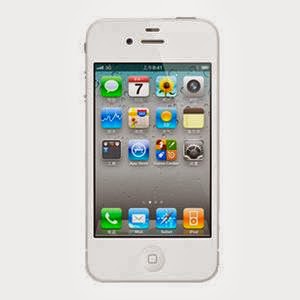
The Human Computer Interface In Apple IOS Application


   User Interface Principles

      The beauty of the overall

      Operation directly


   User Experience Guidelines.

      Consider the sequence

      Make everything easy and obvious

      Use the terminology that can be understood by users


Reference


Interactivity in multimedia application


Introduction

The term "look and feel" is often used to refer to the specifics of a computer system's user interface. Using this metaphor, the "look" refers to its visual design, and the "feel" refers to its interactivity. Every action in your mind after understanding the user interface means you are communicating with the system. That is interactivity. Indirectly this can be regarded as an informal definition of interactivity.

In computer science, interactive refers to software which accepts and responds to input from humans—for example, data or commands. Interactive software includes most popular programs, such as word processors or spreadsheet applications. An essential feature of interactivity is that it is mutual: user and machine each take an active role. Most interactive computing systems are for some human purpose and interact with humans in human contexts.


The Human Computer Interface In Apple IOS Application
 
User Interface Principles


A good man-machine interface specification compliance the way that users' thinking and action, and not depend on the device performance. An user interface which is unattractive and complex will make a good application become worse than before. Otherwise, a beautiful and intuitive perception interface can strengthen the functionality of the application and also can encourage users.
The beauty of the overall
The beauty of the overall, is not simply refer to how beautiful the application interface, but rather whether the appearance and functionality of the application combination perfect. For example, to deal with the task applications usually simplifies the decorative UI elements and put it in the background, so that give the task itself an important position. Then the users can easily understand the aim and the feature of the application.


Operation directly

When the user can operate the objects in the screen directly and no need to use other control to operate, they will be interested in the task itself more easier than before. And also more easier to understand the result of the operate. Multi-touch technology allows iOS users to experience the convenience of operation directly. By using touch screen, the user will have more kindly with the user interface and more sense of control. Because of the users do not need some other devices, like mouse.

In an iOS application, the following ways can allow users to experience the direct operations:

--- By rotating or moving device to affect the screen objects

--- By using touch screen to control the objects which in the screen

--- It seems that to see the result of the operating very soon


User Experience Guidelines.

Consider the sequence

Top of the screen is the most likely to be noticed by the user's. User holding the device, usually has the following ways to interact:

--- Use their not used hands to hold, use the most used fingers to operate.

--- Use one hand to hold, and use its thumb to operate.

--- Between two hands, and use two thumbs to operate.

Put the most frequently used information on the top of the screen, there is most likely to be found. When users access the screen from top to bottom, showing the information should be from the general to the particular, from the high level to the low level.


Make everything easy and obvious

You should try to let your application be understood more easier, because you are not sure whether the user want to spend time to research it. Straight to show the core functions by using the following ways:

--- Reduce the controls which need users to make choices

--- Rational use of standard controls and gestures, and pay attention to maintain consistency

--- Control labels need to be clear, so that the user can clearly know what they are doing


• Use the terminology that can be understood by users
When use the text to communicate with the users, try to use the terminology that can be understood by users. Especially, try to avoid to show some technical speech in the user interface. Because most people like to see the sentences which is simple and concise. These can make them feel comfortable. From the user's point of view to consider whether the words used by apt.
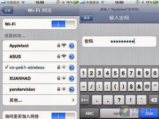
For example, Wifi network settings interface will use simple words to explain.


Reference
Dix, Alan; Finlay, Janet; Abowd, Gregory D.; Beale, Russell (2004). Human-computer interaction. 3rd edn. Pearson Education. p. xvi. ISBN 0-13-046109-1, 9780130461094. Check |isbn= value (help).
<Interactivity>
http://en.wikipedia.org/wiki/Interactivity#Computing_science
Rada, R.; Michailidis, Antonios (1995). Interactive media. New York: Springer-Verlag. p. 12. ISBN 0-387-94485-0.

"Improving interactivity with Javascript". Friendly Bit. Retrieved 2011-10-28                              

INTERACTIVITY IN MULTIMEDIA APPLICATION

Interactivity in multimedia application

Multimedia


As we all know, multimedia is widely used in many sectors such as business, entertainment, art, medicine and engineering. For example, any information that is shared through any electronic medium such as power point, word or usage of search results or animations from internet can be considered as multimedia usage. “Multimedia” comes from the word “multi” which means various and “media” refers to any hardware or software used for communicating (interact with computer to perform certain task).A complete multimedia system consist of five main elements which includes text, graphic, audio, video, and animation (Asuhimi, 2010).


Interactivity

According to Barker (1994:1), interactivity in learning is "a necessary and fundamental mechanism for knowledge acquisition and the development of both cognitive and physical skills". Interactivity is the real key to an effective multimedia title. It gives a feel of more personal to the user. Input devices such as a keyboard, joystick, mouse, left and right arrow keys and touch screen are normally used in interaction process (Assuhimi, 2010).


Interactivity can be accomplished by linking all of the multimedia components that are text, graphics, animation, audio and video into a interrelated interactive application (Rod Sims, 1997). For an effective instructional practice and individual discovery, interaction is vital. 

According to Rod Sims and Roderick (1997) implementation of interactivity is considered as an art as it requires wide-ranging of skills, such as indulgence of the learner, gratefulness of software engineering capabilities, the significance of rigorous instructional design and the use of appropriate graphical interfaces.


Levels of Interactivity

     a)           Linear interactivity

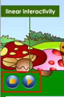
Linear interactivity refers to the collaboration between the user and the multimedia application without controlling the progress of the content. It is a passive interaction in other words. The linear content is usually arranged in sequence (Scribd, 2013). An example of the multimedia linear content is a movie in you tube. Although it uses combination of audio, graphics and animations, the user cannot control over the sequence of events. A button is used to perform one task such as play, pause, and so on. 


     b)    Non-linear interactivity

Non-linear interactivity allows the user to work together with the content depending on their wish. It is a two-way communication where the user able to control the progress and sequence of
multimedia content by using many buttons or links.                                                                           Since the interaction might affect and change the overall arrangement of the presentation, it is more difficult to accomplish and upkeep. Multimedia applications contain both static elements, like text and graphic or image and continuous or dynamic elements, like video and audio files (Asuhimi, 2010).                                                                                                        

According to Dick Bulterman (2007) a hyperlink can be inserted easily into a static object but it is considerably complex for continuous media.


Interactive interface

Computer interfaces are not really interactive as the sequence which drives it are rarely intelligent to behave as tacit associates. If we go more deeper, what is missing in interactivity is that it is actually interactivity is a coupling of complex and dynamic relational between two or more intelligent parties (Krish, 1992).  


According to Krish (1992), interface which is considered good should help us to decide on what to do next. This idea indirectly drives the users in beneficial path is objective for all well designed multimedia interfaces, not only for learning environments. This concept is mutually accepted (Norman, 1998; Hutchins, Hollan and Norman, 1986) that a good interface is responsible to fulfill the principle of visibility where the users should be able to see the actions that are open to them; they should receive immediate feedback about the actions that they have just taken. It is a good practice as the users could know what the computer is doing. And they would get insightful information time to time on the consequences of their actions. The other complicated task is the interactivity built into a multimedia environment which is sensitive to the goals of the user, and help to direct them in fruitful directions as they wish. But it is almost  impossible (Gibson, 1966 cited by Krish, 1992).


Dave Marshall (2001) Interactive Multimedia Applications can be divided into three basic types which include menu driven programs or presentations, hypermedia and simulations / performance-dependent simulations. Menu driven programs has a hierarchical structure which has main menu, sub-menus. Hypermedia on the other hand is less structured. It is non-linear but we can get quick access to information that is required by us. It has more interesting buttons to operate. The third type which is simulations or performance-dependent simulations is what most of us use in order to play games (Dave Marshall, 2001). 


Extent of the interactive media revolution
There are many industries that are already moved to computer basis. As an effect of it the developers are assigned to come out with many new applications. The very visible development done is social media. Example Facebook, twitter, blogger and many web browser which allows us to browse such as Mozilla Firefox, Google Chrome and others ( ATSF White Paper, 2002).


According to ATSF (2002), more challenging and more interactive programs are being produced and upgraded where the user will be involved together with it like games will be controlled by our body movement .More advancements are in progress.


Conclusion

After gone through many websites and articles, I get to know about many things about interactivity and multimedia. Multimedia, the word itself reflects the meaning which is incorporation of text, graphic, audio, video, and animation. But all this components must interact with each other in correct way. If one goes wrong everything will collapse. So, it is important that all must work together to get perfect media.

Interactivity (which is interact) has synonym which is communication. In communication, there will be a listener and a speaker where the listener listens and respond to the speaker. Same goes to interactivity. The user will input or command something and the computer (multimedia) executes it which is referred as interactivity in multimedia applications.
The ability of consumer to control an application defines the type of interactivity. If the program requires the user to only press certain button to and sit back without doing anything is linear interactivity. On the other hand, non-linear interactivity requires the operator to control/decide and perform based on their wish.

As the world is shrinking to our finger tips, thus many applications are designed to be interactive interfaces. This is widely seen in invention of medias such as Facebook, twitter, blogger and many web browsers such as Mozilla Firefox, Google Chrome and others. Interactivity has given a chance to us to explore things based on the users wished. As a user, we should appreciate the gift of interactivity to us.

I would say that this assignment has been an eye-opener for me. I will try to incorporate all appropriate elements which are use full for my future assignments which will be impressive to others. I will try to integrate the information about interactivity and help my team members to complete other assignments and projects.    


Reference

ATSF White Paper, 2002 Interactive Media UK [pdf] Available at:                                       <http://www.atsf.co.uk/atsf/interactive_media.pdf> [Accessed 13 September 2013].

Asuhimi, 2010. Multimedia concepts.  Learning area 4a.blogspot.com, [blog] n.d. July. Available at:                                                                                                    <http://learningarea4a.blogspot.com/2010/07/multimedia-concepts.html > [Accessed 11 September 2013].                                                                                       

Asuhimi, 2010. Interactivity of multimedia-lesson 22, 24. Learning area 4a.blogspot.com, [blog] n.d. July. Available at: <http://learningarea4a.blogspot.com/2010/07/interactivity-of-multimedia-lesson-22.html> [Accessed 11 September 2013].

Dave Marshall, 2001.  Types of Interactive multimedia applications. [Online] (10 April 2001) Available at:                                                                                                          <http://www.cs.cf.ac.uk/Dave/Multimedia/node36.html#SECTION02141510000000000000> [Accessed 14 September 2013].

Dick Bulterman, C.A., 2007. User-centered control within multimedia presentations. [online] Springer-Verlag. Available at:                                                                        < http://link.springer.com/article/10.1007/s00530-006-0065-6> [Accessed 13September 2013].

Kish, D., 1992.  Interactivity and Multimedia Interfaces. [Online] Available at: <http://adrenaline.ucsd.edu/kirsh/Articles/Interactivity/brock-single.html> [Accessed 15 September 2013].

Schwier, 1993. Interactive Multimedia Instruction. [Online] Available at:           <http://www2.gsu.edu/~wwwitr/docs/interact/> [Accessed 12 September 2013].

Scribd, 2013. What is linear interactivity. [Online] Available at: <http://www.scribd.com/doc/58070055/8/WHAT-IS-LINEAR-INTERACTIVITY> [Accessed 13 September 2013].

Sims, Roderick, 1997. Interactivity: A Forgotten Art. [Online] (27January 1997) Available at:<http://intro.base.org/docs/interact/> [Accessed 10 September 2013].