Use of colours and visual
elements
Colours
Introduction
Colours have specific meanings which the meanings was culturally
assigned by humans. As a simple example, a traffic light which consist of three
colours which are red, yellow and green have its meaning. Red to stop, yellow
for caution and green to go. Colour symbolism works differently for each
cultures. Western culture uses white colour as a code for wedding while Eastern
culture uses white colour as a code for funerals. Thus, when we are to choose a
colour we have to consider who is our target audience and how they assign
meaning for colours.

Colour and it's meanings
Hue
“Hue is the term for the pure spectrum
colours commonly referred to by the ‘colour names’ - red, orange, yellow, blue,
green violet - which appear in the hue circle or rainbow.” (Charlotte Jirousek,
1995) Hue colours are also known as primary colour.


Saturation
Saturation is something define the pureness of a colour. The picture
below explains the saturation of the colour red.

Value
Value refers to the darkness and the lightness of a specific colour. The
value of a colour depends on the white and black added to that colour.

Tint
Tint is based on the white colour added into a picture.

Shade
Shade is opposite of tint where black colour is added to a picture.

Warm colours and cool colours
Warm colours are the colour that gives advance attraction to a picture.
Warm colours are usually bright and striking. Example of warm colours are red,
orange and yellow.
Cool colours are the very natural colours which gives peace of mind for
the viewers. These colours are usually soft and trendy. Example of cool colours
are blue, green and violet.


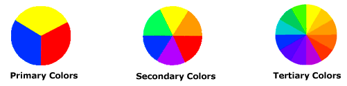
Primary colours
Blue, red and yellow are the three
pigmented colour that stated as primary colours. These three colours cannot be
mixed or combined with any other colours. Colours beside red, yellow and blue
are derived from this three hues.
Secondary colours
Purple, green and orange are the
secondary colours formed by the combination of primary colours.
Tertiary colours
Tertiary colors are the colours
formed by combining the primary and secondary colours together. Example of
tertiary colours is yellow-green, blue-green, red-purple, blue-purple, red-orange
and yellow-orange. The hue of these colours has two name because is it the
combination of primary and secondary colour.
Symbolism of a colour
Red: The colour red brings a meaning of energy and passion. It is the
most extreme and powerful colour in the world. Sometimes the colour of red also
carries out the meaning of anger, violence and aggressive feelings.
Orange: Is a colour of flesh and warmth. Usually this colour will be
combined with red or yellow to show the perfectness of this colour.
Yellow: Is a colour of sunshine. Yellow is a colour that is upbeat and
modern. Yellow can be an overwhelming colour in the colour wheel. It is also
used for caution.
Green: Is a colour of nature and it is the only colour that brings
positive value to the viewers.
Blue: Is a colour that is elegance, cool, trust and peace. Usually blue
is the colour of sky and water.
Violet: Is a colour of fantasy, playfulness and a state of dream. The
negative sight shows nightmares and madness for the colour of violet
Visual Elements
Introduction
Visual elements are the elements that we observe and reacts to when we
look at a work of a design. Visual elements are divided into eight elements of
art. They are such as:
- Line
- Shape
- Mass
- Light
- Colour
- Texture
- Space
- Time and motion
Line
The goal of line is to record the border of form and to deliver
direction and motion to the viewers. Line can be differ in width, length, curvature, colour or direction. Contour lines, lines formed by the edges,
liner forms, broken lines, dotted lines and line of sight are example types of
line that the designer can choose when designing their design.

Shape
Shape is a 2D form that filled an area with identifiable border. Shapes are either made by humans or found in nature. Shape
can be divided into two categories which are organic and geometric and it can
also be actual shape or implied shape. Design with shapes has both figure and
ground. Positive shape of a design is the figure and the negative shape will be
the ground.


Mass
Mass is a 3D form that filled a volume of space. Only in architecture and sculpture will the actual mass exist.

Mass is a 3D form that filled a volume of space. Only in architecture and sculpture will the actual mass exist.
Light
Light and shadow models of an object gives a 2D appearance in its design. Value is refers to the range of lights and dark. Implied mass and light comes together when analyzing a work of art.
Colour
Without the function of light, colour doesn't give any sense. Visual of an object is depends on the reflection and absorption of the light to the object. The three basic characteristics of colour are, hue, value and intensity.- Hue: The colours according to the colour wheel.
- Value: Divided into tint and shadow which implies meaning for the colours. Shows the value of colour from black to white.
- Intensity: Refers to the purity of the colours. In another name it is called as chroma or saturation.
.jpg)
Texture
The surface quality of material which is either tactile or visual as it is one of the elements of art.It is based on the painter's skill.
Space
Space refers to the distance between two point. Spaces are defined by the shapes and forms around or within the object..jpg)
Time and motion
It is a single element as time and motion are related where motion exist in context of time. Time and motion are used by the artist in different ways..jpg)
Conclusion
Over all, a design without colour and visual elements doesn't make any sense. As we see, a colour can convey messages directly to the viewer. Colour is also plays it's role to express an individuals feelings and emotions. Besides that, combination of two colours are now commonly used by the designers to make their design more attractive and meaningful.
Moreover, to perform a very interactive design, designers should also consider the visual elements. It plays an important role too. Beside colours, designers should also give importance to visual elements such as light, space, line, mass, texture, time and motion, shape, and colour that is also a element of visual elements.
By considering colour and visual elements, I believe a design can be interactive and meaningful. By learning this I was able to understand the importance of this elements to make a perfect design of a picture. This knowledge surely will help me to do my project and I hope that I will be able to produce an interactive design.
References
1) Bradley, S. 2010. How To Use Color To Enhance Your Designs - Vanseo Design. [online] Available at: http://www.vanseodesign.com/web-design/color-meaning/ [Accessed: 20 Sep 2013].
2) Char.txa.cornell.edu. 2013. Color, Value and Hue. [online] Available at: http://char.txa.cornell.edu/language/element/color/color.htm[Accessed: 22 Sep 2013].
3) Colormatters.com. 2013. Basic Color Theory. [online] Available at: http://www.colormatters.com/color-and-design/basic-color-theory [Accessed: 16 Sep 2013].
4) Empowered By Color. 2013. Meaning of Colors in Color Psychology. [online] Available at: http://www.empower-yourself-with-color-psychology.com/meaning-of-colors.html [Accessed: 18 Sep 2013].
5) Sites.google.com. 2013. The Elements and Principles of Visual Arts - Visual Arts4Learning. [online] Available at: https://sites.google.com/site/visualarts4learning/week-two-resources [Accessed: 22 Sep 2013].
6) Unknown. 2013. [online] Available at: http://learn.midsouthcc.edu/learningObjects/art/pdf/Unit3AVocabScriptVisualElements.pdf [Accessed: 22 Sep 2013].
No comments:
Post a Comment
Note: only a member of this blog may post a comment.