DESIGN PRINCIPLES
For multimedia application
Design
"What is design? A plan for
arranging elements in such a way as to best accomplish a particular
purpose." - Charles Eames (Donna Tersiisky, 2004 cited in Faimon &
Weigand, 2004, p.13).
A design is created with elements of
line, shape, color, value and texture that are put together using the
principles of balance, emphasis, unity, proximity, and variety (Donna
Tersiisky, 2004 cited in Brainard, 1998, p.4). I am going to briefly discuss
about the principles of balance, emphasis, and proximity.
Elements
The elements of design are the building
blocks of design. “Elements are like the ingredients in a recipe (Donna
Tersiisky, 2004 cited in Faimon & Weigand, 2004, p.13), the parts of a
machine (Donna Tersiisky, 2004 cited in Evans & Thomas, 2004, p
4) or the notes in music. On their own, these elements may do little, but
put together skilfully, they create a cake, a car or a concerto.”
According to (J6 design, 2011), the
elements of design are as following:
- LINE - The linear marks made with a pen or
brush or the edge created when two shapes meet.
- SHAPE - A shape is a self-contained defined
area of geometric like squares and circles, or organic like free formed
shapes or natural shapes.
- DIRECTION - All lines have direction like
Horizontal, Vertical or Oblique.
- SIZE - Size is the relationship of the area
occupied by one shape to another.
- TEXTURE - Texture is the surface quality of a
shape whether is it rough, smooth, soft hard, glossy and many more.
- COLOUR - Colour
is the light that is reflected off objects.
Principles
The principles of design are the
guidelines that are used for putting elements together to create effective
communication (Donna Tersiisky, 2004 cited in Brainard, 1998, p.92). The
elements are categorised as the ‘what’ of a design and the principles are
categorised as the ‘how’ (Donna Tersiisky, 2004 cited in Faimon & Weigand,
2004, p.25). “Using the recipe metaphor - the elements are the ingredients and
the principles are the directions.” (Donna Tersiisky, 2004)The principles of
design are difficult to separate from one another. An effective design is
created only when they are working together.
1. Balance
“Try
walking a long distance with a 2 pound bag of rocks in one hand and a 10 pound
bag of marbles in the other. After a while you will want to shift your load
around, putting a few marbles in the rock bag to balance your load, make it
easier to walk. This is how balance works in design.” Visual balance achieved
by either arranging elements on the page so that no one section is heavier than
the other or by arranging the elements out of balance to create tension or a
certain mood. (Jacci Howard Bear, 2011.). There are five types
of balance. They are horizontal balance, vertical balance, radial balance,
symmetrical balance, asymmetrical balance.
Horizontal and Vertical Balance
Vertical and
horizontal balance is where objects are balanced left and right (horizontal)
and top to bottom (vertical) of central axis (Patrick Cox, 2011).


Examples of Horizontal Balance:


Examples of vertical Balance:


Example of Vertical & Horizontal Symmetry:

The shape in this design divides into four equal sections. Although it is not mirror images but they are similar in shape and the overall look is very symmetrical and balanced (Jacci Howard Bear, n.d.).
Radial Balance
Elements can also be balanced off of a central point. Basically, elements will be located around, like elements are coming out of central axis point (Jacci Howard Bear, n.d.). (Refer to ex.2)


Example
of Radial Balance 1

Symmetrical and Asymmetrical Balance
Symmetrical and asymmetrical balance is a type of balance that combines vertical, radial, and horizontal. (Jacci Howard Bear, n.d.).
Symmetrical also
called as formal balance is mirror image balance. They may not be identical
objects, but they are similar in terms of numbers of objects, colors and other
elements (Bonnie Skaalid, 1999). (Refer to Ex.3).
 Ex.3
Ex.3
Sometimes they are completely identical and it is often seen in architecture. (Bonnie Skaalid,1999).

Sometimes they are completely identical and it is often seen in architecture. (Bonnie Skaalid,1999).
.jpg)
On the other hand, the items in asymmetry are balanced but not by identically or similarly to each other. It is probably the most common interesting form of balance than symmetry.
However, asymmetry does not mean there is zero balance in the composition but it’s just that the elements are not positioned in carbon copies of each other (Jacci Howard Bear, n.d.). (Refer the examples below)
Examples of asymmetrical balance:


Examples of symmetrical and asymmetrical balance :


2. Emphasis
The principle of
emphasis is used to create dominance. Dominance means it is
dominating (noticeable) than other elements (Yangjoo Park, n.d.). There is
usually a focal point which will draw the attention to the most important
element on the page. There are several techniques used to emphasize the most
important object on a page (Bonnie Skaalid,
1999). When some things get more attention, some get
less. Those are subordination. Three major methods are controlling emphasis.
They are contrast, placement, and isolation (Yangjoo Park, n.d.).
CONTRAST
Contrast can be
simply defined as difference. The objective of contrast is to produce
maximum prominent to an item. The more contrast an object is the more
prominent it will be. Contrast in a work is achieved by size, shape, and
color/value (James T. Saw, 2001).
Color/Value: Color contrasts are usually less strong than value
contrasts. Dull colors are less attractive than bright colors. Bright colors
attract the attention. Strong value contrast should be used to make
something stand out. For example:

The first, (dark) & violet bar, is clearly visible against the white background but barely visible against the black. The second, (light) bar’s and the two yellow bars’ contrasts are the opposite (visible against the black background. The third (gray) bar is equally visible against both black and white but has low contrast. The black to white (fourth) bar has maximum contrast at either end.The two red bars are middle values and contrast well. However, the brightness of the red makes it more visible (James T. Saw, 2001).

Ex.4
Notice that in Ex.4 we can “see” the red color
wording easily because of hue contrast but all of other words are easier to
“read” because of value contrasts.
Examples
of color/value contrast:


Size: Bigger is always better when it comes to being
noticed. The bigger the size the more noticeable it will (James T. Saw, 2001).
Examples of size
contrast:


Shape: A geometric shape will be noticeable when the rest
of the items are irregular (Bonnie Skaalid,
1999). The reverse is also works. But the contrasts of shapes
are not as strong as color/value or size contrasts (James T. Saw, 2001).
Examples of shape
contrast:


PLACEMENT
Placement
(where the item is) of items in relation to the format and each other can
affect emphasis.

Ex.5
Refering to Ex.5, Center (1) is the prominent place. Center point is where a
viewer’s eyes will look into first. (2) creates attention by overlapping to the
edge. It appears like coming in or to be going out of a composition but it only
works when the design is clear and simple. It is also can be used to show an item
is in the front of a design. A focal point should be determined in order to use
similarity, continuance, and proximity relationships to decide the next
noticeable item (James T. Saw, 2001).
Proximity: An overlapping, touching or close to primary object
is likely to be seen next in that order. The more contrasting the object is,
the more likely this is to happen. The placement of objects is important (James T. Saw, 2001).

Similarity: An object with the same color, size and/or shape
will form a group with the primary object and be seen next. The stronger the
link when the more alike the two objects are. Texture can be also
an effective similarity device (James
T. Saw, 2001).

Continuance: Continuance can be described as a device for
directing the viewer's attention when looking at a composition. When the main
item points another item, automatically that item will become secondary.

Refer to the example shown below. All will notice the small circle that the hand points at in preference to the closer, larger circle (James T. Saw, 2000).

ISOLATION
Isolation
is also a kind of placement. An object is separated from grouped objects. This
technique is use to make an object to be prominent; not to be seen first (James
T. Saw, 2000).

In
the above example, the circle in the group will be seen first but the ‘one
circle’ will stand out (James T. Saw, 2000).
3. Proximity
Proximity can simply define as closeness. Proximity creates a bond between people and between elements on a design. How close together or how far apart elements are placed suggests a relationship. Unity is also achieved by using a third element to connect the distant parts.There are four types of proximity relationships. They are close edge, touch, overlap and combining (About.com, n.d.).
Close
edge
Proximity simply
means when few items are close to each other, they will be seen as a group (James T. Saw, 2002).

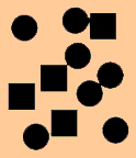
In the above example,
the 14 objects form 3 groups but a small circle which is at the bottom seem to
be not in the grouping (James T. Saw, 2002).
Be happy
This type of grouping
widely used with printed kind. The two word ‘Be’ and ‘happy’ in the example
above, can be easily identify as 2 different words due to the space in between
them (James T. Saw, 2002).
B e . h a p p y
Previously the space
that has been used in between ‘Be’ and ‘happy’ is now used in between of each
alphabets and double space is used between the two words (James T. Saw, 2002).
FREE . . . .WATER
FOOD .. . .. SOLD
FOOD .. . .. SOLD
We usually read words
from left to right but also from top to bottom. The close edge relationships
can form groups in any direction. Refer to the example above.
Example of close edge

Touch
Items touch when they get close enough.
It should be noted that they are only seem to be together but they are still
different objects. Close edge grouping are less strong than the one which is
overlapping. The shape relationships are more noticeable because there are no
size differences (James T. Saw, 2002).

Overlap

In above example, the
use of two colors highlights the overlap. When single color is used the
overlapping cannot be seen clearly. It will look like a formation of different
shape and the overlapping is not visible. When it comes to hierarchy of
grouping, overlapping is the strongest followed by two different color, single
color, touching, and lastly close edge (James T.
Saw, 2002).

Combine
An eternal element can be used to
group various items together. A simple is when we underline few words. The
underline will group the words together. In this case ‘underline’ acts as
combining device (James T. Saw, 2002).

In the example above, the black and red
squares combine the objects and grouped with the big square. These are the one
which stands out at last (James T. Saw, 2002).

Example
of combine (the alphabets are combine by the background) (James T. Saw, 2002).
Conclusion
In conclusion, this assignment
has really helped me to know various facts about the design principles for
multimedia as whole.
First of all, we should plan the
hierarchy how the content should be seen. The appearance of information
(whether in the form of text or graphics) effects the way we perceive it.
I will apply the three principles
(principle of balance, emphasis, and proximity) in my group assignment. I think
all three principles are essential for the group assignment. Balance is the
main which gives an impression of steadiness to a design. Too much of items in
a single design will be overcrowded and confusing. It is very important to make
sure the distribution of visual weight is equal in a design. The balance should
be reached in way of vertical, radial, horizontal, symmetrical or
asymmetrical balance.
 The
next principle that I will apply in my design is emphasis. This principle is
vital because it will allow one particular element in the design to stand out
and will emphases the message that me and my group members wanted to
convey by the design. This principle can be placed on any important aspect
of the design. The organization of visual hierarchy is significant to decide
which one is most important and should be more visible to the least by using the either
methods of contrast, placement, or isolation.
The
next principle that I will apply in my design is emphasis. This principle is
vital because it will allow one particular element in the design to stand out
and will emphases the message that me and my group members wanted to
convey by the design. This principle can be placed on any important aspect
of the design. The organization of visual hierarchy is significant to decide
which one is most important and should be more visible to the least by using the either
methods of contrast, placement, or isolation.
The following principle that I
will use is proximity. This principle will able a relationship between two
graphic or non-graphic objects based on their distance from each other and
their linkage through a third object by using either type of the following: close edge, touch, overlap and combining.
Although design can be divided into many principles, all the principles need to work together to form a successful design.
I will contribute my best,
cooperate with my group members to do my group assignment with the knowledge
that I gain from this assignment to make sure all the elements of design are
well balanced, working together, and eye catchy.
Reference
Donna
Tersiisky, 2004. The Elements and Principles of Design. [Online] Available at:
<http://nwrain.net/~tersiisky/design/design.html> [Accessed 17 September
2013].
J6
design, 2011.6 Principles of Design. [Online] Available at:
<http://www.j6design.com.au/ClientArea/6fundamentalprincipleofdesign>[Accessed
17 September 2013].
Jacci
Howard Bear, n.d.. Principles of Design. [Online] Available at:
<http://tympanus.net/codrops/developing-balance-in-web-design/> [Accessed
18 September 2013].
Patrick Cox, 2011.Developing
Balance in Web design. [Online] Available at:
<http://tympanus.net/codrops/2011/09/13/developing-balance-in-web-design/>
[Accessed 18 September 2013].
Bonnie Skaalid, 1999.Classic
Graphic Design Theory. [Online] Available at: <http://www.usask.ca/education/coursework/skaalid/theory/cgdt/designtheory.htm
> [Accessed 19 September 2013].
Yangjoo Park, n.d..Design Elements & principles. [Online]
Available at: <http://www.edb.utexas.edu/minliu/multimedia/PDFfolder/DESIGN~1.PDF > [Accessed 19 September 2013].
James
T. Saw,2001.Emphasis. [Online] Available at: <http://daphne.palomar.edu/design/emphasis.html > [Accessed 20 September 2013].
James
T. Saw,2001.Using Value. [Online] Available at: <http://daphne.palomar.edu/design/value/UseVal.html > [Accessed 20 September 2013].
James
T. Saw,2000.Gestalt. [Online] Available at: <http://daphne.palomar.edu/design/gestalt.html#anchor1130271> [Accessed 21 September 2013].
About.com,n.d..Principles of Design. [Online] Available at: <http://desktoppub.about.com/od/designprinciples/l/aa_pod1.htm > [Accessed 21 September 2013].
James
T. Saw,2002.Similarity And Proximity. [Online] Available at: <http://jimsaw.com/design/simnprox.html> [Accessed 22 September 2013].
No comments:
Post a Comment
Note: only a member of this blog may post a comment.