Color.

Introduction
Color is the most important thing in designing something, without color the design will be plain or even transparent. Every color have their own characteristic and use in different situation. We must know what color we will use to make the design more alive or real.Color Wheel
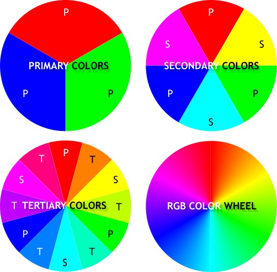
As we can see above, there is a color wheel, the primary color symbolized with P, there are Red, Green,and Blue. The secondary color is symbolized with S, there are Magenta, Cyan, and Yellow. Secondary color is made by combining the primary color, Red + Blue = Magenta. The tertiary color symbolized with T, there are 6 colors in tertiary Orange, Spring Green, Turquoise, Ocean, Violet, Raspberry. Tertiary is made by combining primary color with secondary color example Red combines with Yellow will make Orange. If all primary color combined together it will make White.
Advantages of Using Color


- Colors can effectively support human performance in visual information processing. Users find colors more pleasant, more pleasing, inspiring or useful than a monochromatic presentation. Colors can increase the users' self-assurance to find their way around and to find the information they are searching for.
- Color can be a very strong identifier of your product or brand and for the advertisement because the important thing about advertisement is the people quick glance, and how that attracts attention and makes people want to know more about it.
- As we can see above there are both old advertisement and usually it placed in a street way. In the right we usually just glance it for a moment and then go away, but in the left when we glance at it we want to read and want to know more about it.
Color Meaning
- Color can influence our emotions, our actions and how we respond to various people, things and ideas. Many people believe that colors are powers. It can also affect our mood. Below here just a few examples of color and its meaning.
 Warm Colors: Such as red, orange and yellow are the colors of fire. They symbolized warmth. Warm colors are more often related with passion, energy, impulsiveness, happiness, coziness, and comfort. They attract attention and have the advantage of being inviting and harmonious.


Cool Colors: Such as green, blue, and violet are more often considered with calm, trust, and professionalism, sadness and melancholy.

Red: energy, war, danger, strength, power, determination, action, confidence, courage, vitality, passion, desire, and love.

Yellow: joy, happiness, wisdom, and intellectual energy.
Blue: masculine, trust, loyalty, wisdom, intelligence, expertise, confidence, stability and depth.

Orange: joy, sunshine, the tropics, enthusiasm, happiness, fascination, creativity, determination, attraction, success, encouragement, stimulation, and strength.

Green: nature, growth, hope, freshness, and fertility. Green is associated with healing, stability, endurance, harmony, safety. life, and well being.

Purple: power, nobility, luxury, ambition, wisdom, dignity, independence, creativity, mystery, and magic. Light purple is seen as feminine and purple is a popular color with children.

Brown: It’s associated with material things, order, and convention

Black: power, elegance, formality, death, evil, and mystery. It denotes strength and authority, is seen as formal and elegant.
Gray: sorrow, detachment, and isolation. It connotes responsibility and conservative practicality. It’s a neutral color and creates a non-invasive feeling. It’s associated with security, maturity, and dependability.
White: light, goodness, innocence, purity, virginity. It usually has positive connotations and is seen as clean and safe.
Visual Elements.
Introduction
Visual elements of art are the basic properties of a work of art that. Visual elements can be observed when we look at a design. To make a good design we need to use visuals element in the right portion. There are six visuals elements Texture, Space, Shape, Color, Tone/Value and Line.Texture
Texture is surface quality either tactile or visual. Texture can be real or implied by different uses of media. It is the degree of roughness or smoothness in objects.
Space
 Space is the area provided for a particular purpose. Space includes the background, foreground and middle ground. Space refers to the distances or areas around, between or within things. It has two kinds: negative and positive.
Shape
 Shape is made by line that connect from a point and back to that point again that makes a shape.It is two-dimensional space that can be defined by edges, setting one flat specific space apart from another. Shapes can be geometric like square, circle, hexagon or organic like the shape of a puddle, blob, leaf, boomerang.
Color
Color is an important element in design. Color has a big impact about how people
assess a design. It also known as the most complex element, because there are countless colors exist, and how we pick the most suitable is not an easy thing.Tone/Value
Tone is the degree of light and dark in a design. It is the contrast between black and white and all the tones in between. Value can be used with color as well as black and white. Contrast is the extreme changes between values.Line
 Line is the basic element of design, defined as a mark that spans a distance between two points (or the path of a moving point), taking any form along the way. It can create texture and can be thick and thin.
Conclusion.
Color and Visual elements are interrelated, we can't make a design without these things. I learn that making a design is not an easy task, we must know the right choice of color and other visual elements in right way. We can't indiscriminate make a design, we must know our target first before make a concept of the design we will make. It is important to know about these to make our design can be accepted by the target.References:
The RGB Color Wheel [online] <http://blulob.com/2009/03/08/the-rgb-color-wheel/>
Unknown. Use of Colors [online] <http://www.sapdesignguild.org/goodies/diagram_guidelines/color_bk.html>
Joyce color meanings, choosing colors [online] <http://www.designbyjoyce.com/color_meanings.html>
Steven Bradley. How To Use Color To Enhance Your Designs [online]<http://www.vanseodesign.com/web-design/color-meaning/>
Marvin Bartel. Elements and Principles of Design [online] <http://www.incredibleart.org/files/elements2.htm>

No comments:
Post a Comment
Note: only a member of this blog may post a comment.