Introduction
Multimedia application is a collection of a variety of
media resources, establish logical relationship of all kinds of information,
the client use to control and display through human-computer interaction
interface.
A
good design begins with an awareness of lots of elements which include: line,
texture, directions, value, shape, color and size.
It
is very important for us to follow the principles when we start to design a
multimedia application.
Design Principles of Multimedia
Application
Harmony

Harmony in design
principle meas all parts of visual iamges related to and complement each other. Harmony in graphic design can be displayed through a variety of ways, usually by a
delicate balance of variety in repetition. When you have all sorts of elements,
but put them together by some common traits, you are creating a harmony between
the different parts of the whole. Woven together by introducing some common,
through the shape, color, function, etc... Can bring the feeling of design
harmony.
in the image provide above, we can see the circle pattern repetition in a intersting way, the overall visual image comes together, pattern or shapes and help us to avhieve harmony druing designing.
This
means that the simple, each element in the design work is feel belonged there,
creating a whole unit in many pieces.

Unity
design can bring a warm feeling to the audience, because in general, the sense
of unity is warm.
BALANCE
The
objects on the screen should strive to balance the up and down or so. Data as far as possible not to pile upon a
certain place, don't have desultorily feeling.
Examples
of good and bad balanced design。

Above
is a graphic I saw which goes against the principles of balance, it takes long
time for the readers to balance the picture in their minds. But the right balanced
graphic is very formal in appearance.
PROXIMITY
Proximity
helps creates organization. By dividing similar elements together or in close,
the designer can create relationship of the elements, it is a principle of management related to the design of elements,
the said that they should be grouped into close to the plane containing the
whole work. Whether a web page, physical pages, or even bigger things like
posters or billboards. No matter, says principle provision, the related
elements should be able to close to each other. It also
provide a focal point can help the reader to get ideas where should start to
read and where to stop. But proximity does not mean that all the element have
to be placed together, it means they can be visually connected in somewhere,
maybe in font, font size and color.

From
this principle, we can find there are a connection offered through its
implementation, the proximity principle conveys that togetherness,
the connection cannot be broken otherwise it will be a bad design.
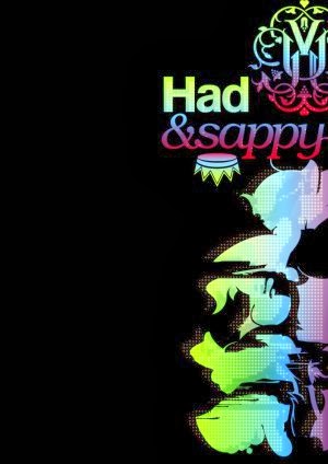
REPETITION:
Repetition
is to point to: design aspects of the need to repeat in the whole works.
Repeating elements can be a font, a thick line, a project symbol, color, design
elements, or it could be a format, spatial relationships, etc., the reader can
see any ways can be used as a repeating element. Repetition is one of the
purposes of unity, and enhance the visual effect.
Repetition
can strengthens a design instead of tying individual elements together, it
helps to create association and consistency.

In
this photo, created one of the key duplicates (gallery), along with color and
spatial relationship of repeated, can transform these items and maintain a
consistent look and feel, makes the work is very professional.
Contrast
Size contrast
Size
contrast in one of the most respected elements of design, the size difference
is less, the sense that gives a person a shen with moderate, difference is big,
the size of the sense that gives a person is bright.

As
the picture provide above, the right graphic provide with a bigger size
contrast than left, it shows more attractive of reader’s eyes.
Color contrast
Color
has a stronger visual impact than other visual elements, and easy to arouse
people's psychological change and emotional reaction at the same time, when a user
see a multimedia application, the first notice is color., according to a survey
of the American popular color studying center shows when people is in choosing one
product, there is a "seven seconds
law ” in this brief but very important 7
seconds, the role of color accounted for 67%, become an important factor
decided to judge the application, in the interface design, if the color
selection and collocation is proper, can in a short period of time to new users
to leave deep impression, will bring the result that expect is less than our
design. The table blow shows the different colors give different feelings.
Color
|
Feelings when people saw these
colors.
|
Red
|
Enthusiasm,
initiative, joy and anger, blood
|
Orange
|
Happiness,
trust, vitality, fresh, autumn
|
Yellow
|
Warm, transparent, happiness, hope, wisdom and brilliance
|
Green
|
Health,
life, peace, peace, security
|
Blue
|
Reliable,
power, cool, credit, eternal, relaxed, professional
|
Purple
|
Intelligence,
imagination, mysterious, noble, elegant
|
Black
|
Deep,
dark, contemporary feeling
|
White
|
Simple,
the Spring Festival, fresh and clean
|
Gray
|
Calm,
neutral
|
From
a report of a web analytics company named KISS metrics , we clearly can see
that both men and women like blue and green, perhaps this is the most common
color in nature ; Both men and women more hate orange and brown. And different
is men like black, while women hate grey; Women are like purple, while men hate
purple. So that color preference of men and women is different. We should
consider this differences before start to design a multimedia application.


Examples
of good and bad color chose

Most of the people will
click the left green button, because in terms of intuition, and green represents
the passage, permitting, through the meaning of the red tend to warn and stop.
So
when start the design, not simply to match color with his be fond of, there is
a big part of the reason by the positioning of the product itself as well as
the standard color and overall tone and decision, and we should fully consider
the feelings of users when they are using, although not completely satisfy all
users, but at least we have to take care of most of the users. Understanding to
the customer for the product positioning, we can determine how to choose the
most appropriate color direction for design.
Conclusion:
After
this assignment, I have a clear understanding about the design principle of
multimedia applications. First of all, I
know the design elements, which
include: line, texture, directions, value, shape, color and size. And know the principles of designing a
multimedia application. Harmony, unity,
balance, proximity, repetition and contrast. Color also is very import during
designing, this will guide me to design in my future life.
Reference:
The-5-basic-principles-of-design.
[Online] Available at:
[Assessed at 22
September 2013]
THE ELEMENTS OF DESIGN. [Online] Available at:
<
http://www.johnlovett.com/test.htm>
[Assessed at 22
September 2013]
Multimedia Design Principles. [Online] Available at:
<http://www.google.com/url?sa=t&rct=j&q=&esrc=s&source=web&cd=1&cad=rja&ved=0CCwQFjAA&url=http%3A%2F%2Fweb1.arthurphil-h.schools.nsw.edu.au%2F~tas%2FMultimedia%2FWebsite%2FTerm4%2FResources%2FdesignprinciplesMM.pdf&ei=95VAUs7bNYnqrQeejYHgCg&usg=AFQjCNHViDuTmY_abcqmb7HYkJX5I67Ysw&sig2=5I1Q_UmwnwKT_prWLL5ZRg&bvm=bv.52434380,d.bmk>
[Assessed at 22
September 2013]
The Graphic Design Rules of Engagement. [Online] Available at:
<
http://pelfusion.com/the-graphic-design-rules-of-engagement-part-1-the-principles/>
[Assessed at 22
September 2013]
No comments:
Post a Comment
Note: only a member of this blog may post a comment.