1.
Introduction
In
this 21st century, colors have become the main element of graphic
design. Can you imagine graphic design without colors? Without colors, the
design will become transparent, even black and white can be consider as a color.
We can find colors almost everywhere and most of them looks beautiful in our
eye. We can’t separate from colors and any other visual elements. It is what
makes flower become beautiful, buildings become elegant or rich in texture and
a lot of shapes, mountain scenery looks stunning and many more. In this write
up, I will conduct a background studies about uses of colors and visual
elements.
2.
Color Wheel
Color
wheel or color circle consist of three main colors which are red, blue, and
yellow. Sir Isaac Newton was the person who designed the first circular color
diagram in 1666 (colormatters.com, 2013). Since then, there are a lot of studies and designs from
scientists and artists about this concept. However, the majority color wheel is based on
the RYB color model which consist of 12 colors (tigercolor.com, 2013). There
are three different definitions or categories based on the color wheel which
are primary colors, secondary colors, and tertiary colors (tigercolor.com, 2013).
Ø Primary colors
consist of three colors, red, blue, and yellow.

Ø Secondary colors
are a combination of two colors in primary colors. The colors result from this
combination are purple (red + blue), green (blue + yellow), and orange (red +
yellow).
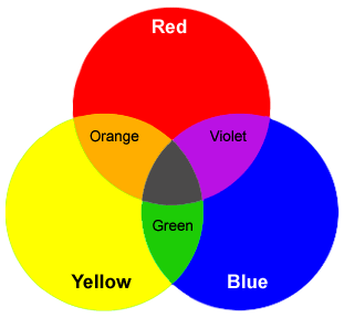
Ø Tertiary colors are
also a combination of two colors, but the one which make it is different from
secondary colors is that the type of colors. For secondary colors, it stated
that the combination of two primary colors, however tertiary colors are created
by combining primary and secondary colors. The results are red-orange,
yellow-orange, yellow-green, and etc.

Beside
categories based on color wheel, there are some term we can find from this
colors, which are warm colors, cool colors, tints, shades, and tones. Warm
colors more toward to energetic and vivid. In the other hand, cool colors more
toward to calm condition or harmony. As for white, black, and gray are
considered as neutral colors.

Tints,
shades, and tones are three terms that often used incorrectly (tigercolor.com, 2013). Tints are the
lighter color that come from adding white color to pure color like adding white
to blue or orange. The darker color that comes after adding black color to pure
color is called shades. And the last term is tones which is the result after we
added gray color to the pure color. Pictures below are the examples of tints,
shades, and tones.
Tints

Shades

Tones

3.
Color Harmonies
We
can describe color harmonies as some colors that seen together and it produced
a pleasant response like when we write something using black pen color on a white
paper and it will make easier for us to read it. Another example of color
harmonies is flower. Most of the time, flower’s color has a brighter color than
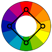
the surrounding areas. There are six techniques that we can use for creating a
color harmony or color scheme based on color wheel. Complementary color scheme,
analogous color scheme, triadic color scheme, split-complementary color scheme,
rectangle (tetradic) color scheme, and square color scheme are the six
techniques (tigercolor.com, 2013).
- Complementary color scheme consists of two different colors that are opposite to each other on the color wheel such as red and green. This technique will create maximum contrast and maximum stability to the object. It is very useful when you want something to stand out, however it is not recommended for text using.

- Analogous color scheme created from colors that are next to each other on the color wheel. These three colors usually match well and create comfortable designs, and we often found analogous color scheme in nature and pleasing to the eye. We need to have enough contrast when we choosing analogous color scheme. Choose one color to dominate the object, one to support the color, and one to use (along with black, white or gray) as an accent.

- Triadic color scheme uses colors that are equally spread out around the color wheel or able to create a perfect triangle shape. This color scheme tend to be quite vibrant. To make triadic color scheme work perfectly, the color should be wisely composed. Choose one color to dominate and other two for accent.

- Split-complementary color scheme is another variation of complementary color scheme. Another variation means it has two colors adjacent to its complement compare to complementary color scheme which only has one color adjacent to its complement. This color scheme will create a same strong visual contrast with complementary color scheme, however it has lesser tension compare to complementary. This technique or method is suitable for beginners because it is difficult to mess up.

- Rectangle (tetradic) color scheme is a combination of two complementary color that make a rectangle shape from the color wheel. It has rich color scheme and offers plenty of options for variation. To make this color scheme look perfect, we should pay attention to the balance of the warm and cool colors.

- Square color scheme is the last technique or method of color choosing. This method almost the same with triadic color scheme, the only thing that make it different is the number of color we use. From the name we can know that it uses four colors from color wheel that create a square shape. Almost the same with rectangle color scheme, this color scheme works best when we put one color as dominant color. This method also need to pay attention to the balance of the warm and cool colors.
4.
Color Symbolism
Chart
Red = love, power, strength, blood, fire, desire.
Blue
= calm, water, peace, cold, loyalty, sky.
Yellow
= happiness, idealism, betrayal, illness, jealousy, summer.
Green = nature,
environment, youth, peace, harmony, eternity.
White = pure, clean, peace, innocent, winter, snow, death (eastern), marriage (western).
Black = darkness, evil, wealth, elegance, formality, mystery, death (western).
Gray = solid, sadness, maturity, dignity, security.
White = pure, clean, peace, innocent, winter, snow, death (eastern), marriage (western).
Black = darkness, evil, wealth, elegance, formality, mystery, death (western).
Gray = solid, sadness, maturity, dignity, security.
5.
Visual Elements
Visual
elements can be describe as a visible character that contribute to the
appearance of a design such as line, shape, form, color, value, and texture.
5.1 Lines
Lines
are the basic building blocks in graphic design (smallbusiness.chron.com, 2013). It can be made from pencil,
pen, mouse, brush or any other tool. It can create a shape, outline, texture,
and can be thin line or thick line. There are several types of line such as
actual line, contour line, and implied or psychic line (incredibleart.com, 2013).
1. Actual
line
This
is the normal line that we usually draw by pencil, pen, or other tools. We can see
the thickness, length, and continuous mark from this line whether it is straight,
curved, or dashed.

2. Contour
line
An
outline, or internal line. This is the line where we can easily find it from a
shape or form of an object.

3. Implied
or Psychic line
As
we can understand from the name, this is not an actual physical line. Means the
line is psychological, when we pointing at something, our eye will travels from
our hand to the object as if on a line or when we throw a ball, we can see the line
that it created when the ball travel through the air before it hit the ground.

5.2 Shape
Shapes
are different from form. We can see the differences from the dimension of the
object. Shapes are two-dimensional object, and forms are three-dimensional
object. As we know for two-dimensional object only has height and length.
Example of shapes are rectangle, triangle, square, circle, pentagon, and etc.
There are two types of shape, organic shape and geometric shape. Organic shape
means it comes from the nature and it is not made by people, as for geometric
shape can be made from people or come from nature. Illustrations below are
example of organic shape and geometric shape.


A
three-dimensional object that has a volume and thickness. Form can be seen from
many different angles and we can apply use of light ant shading technique to
create a 3-D effect.

5.4 Color
Color
is one of the most important element in graphic design. Different color has a
different meaning based on the purpose like religious, holiday, emotion, and
etc. Colors can be divide into two type based on color wheel, warm and cool
colors. Some color scheme techniques can be find in use of colors, such as tints,
shades, tones, complementary, analogous, triadic, split-complementary, rectangle,
and square color scheme.
5.5 Value
Value
can be describe as the lightness or darkness of a color. Black and white have most
important role in here. High contrast, low contrast, and black and white are considered
as value. Changing value of a color can make a two-dimensional object looks
like three-dimensional object.

5.6 Texture
Texture
is one of the visual element that we can see every day. Wood pattern, dry land
pattern, wall pattern are several types of texture. Texture can be visual and
tactile.


6.
Conclusion and
lesson learn
Through
this background studies I have learnt that colors are important in our life and
graphic design. We can find lots of types of colors and different color
resemble a different meaning. Red for love, blue for calm, yellow for
happiness, green for environment, white for peace, and so on. However, some
colors have a different meaning in a different countries, for example white and
black have a different meaning in Eastern and Western countries. There are
several technique that we can apply when we want to choose colors that we want to
use, such as complementary which two colors that opposite to each other in
color wheel, analogous which choose from color that next to each other, triadic
which colors that make a perfect triangle in color wheel, split-complementary which
is another variation of complementary, rectangle which uses pair of
complementary color scheme, and lastly is square which color chosen from four
colors that make a perfect square shape. Visual elements consist of lines,
shapes, forms, textures, value, and colors.
Last
but not least, color used methods, types of colors, types of visual elements
are the three elements that we always see. Colors can make us easy to learn
something because it has been in our daily life.
7.
References
Basic
color schemes: Color Theory Introduction. 2013. Basic color schemes: Color
Theory Introduction. [ONLINE] Available at:
http://www.tigercolor.com/color-lab/color-theory/color-theory-intro.htm.
[Accessed 22 September 2013].
Basic
Color Theory. 2013. Basic Color Theory. [ONLINE] Available at:
http://www.colormatters.com/color-and-design/basic-color-theory. [Accessed 22
September 2013].
Symbolism
of Color: Using Color for Meaning. 2013. Symbolism of Color: Using Color for
Meaning. [ONLINE] Available at:
http://www.incredibleart.org/lessons/middle/color2.htm. [Accessed 22 September
2013].
Visual
Arts: Elements and Principles of Design. 2013. Visual Arts: Elements and
Principles of Design. [ONLINE] Available at:
http://www.incredibleart.org/files/elements2.htm. [Accessed 23 September 2013].
Elements
of ART . 2013. Elements of ART . [ONLINE] Available at:
http://www.johnchiappone.com/elements_of_art.html. [Accessed 23 September
2013].
No comments:
Post a Comment
Note: only a member of this blog may post a comment.