I-
Introduction
We can defined Layout as the method, plan, graph or design in
which the parts of some elements are arranged
Layout design is a simple design, it is the visual
communication. Newspapers, magazines, books and other paper designers don’t
have only to put appealing to the eye, but also tell and show what is important
in the history, text and message through their drawings. A good design suggests
not only the story and photos, but a context also. History
of Layout Design and Modern Newspaper and Magazines (Anon, 2012).
II-
Page
layout design
Page layout is the process of combining
text, image and negative space on the page to produce a balanced, and pleasant
visual impact that would enable the reader to build collective meaning and a
message for the text. No text has a unique meaning or a unique message, that’s
why different designs create different meanings and different messages for the
same text.
When it comes to design our newspaper, book’s cover page, website and so
on we usually use “GRID”. With the grid as layout guide, we will see with different
ways how elements, text, images, graphic objects, and so on can work mutually
to generate successful layouts. The use
of grid layout is an advantage for us to design our page. So we can’t talk
about layout design without the grid which offers an arranged structure for
layout. The grid layout must allow us to dictate the look and feel of our
publication. Grid structures are very important for documents containing a combination
of text and graphs
III-A Types of layout.
III-A-a- Grid Layout (basic structure)
1 1- 2-column
grids
.
2-column grids are mainly
used in books, newsletters, or publications where the width of the column is narrow.
Even if this provision is too easy, you may always get variety by enable certain
elements, for example, images and titles for covering two columns on the page.
The image1 below shows example.

image1
1-
3 column grids
Three column grids provide additional flexibility than grid with 2
columns as both (text and graphic) can extend over all columns. Grids with 3
columns work for the majority layouts, same for those large, and are principally
suitable for publications that don’t need difficult classification of elements.

image2
1- More than 4 column grids:
When it comes to put a diversity of elements in the layout of
text, photo, and so on, we will realize that the gates with more than 4 columns is more flexible.
In general, the grid with an odd number of columns in the grid works
better. 5 and even 7 grids columns are more flexible and also allow asymmetric post
of elements, which tends to be more attractive than a symmetrical arrangement
or layout.
This examples down shows us two different ways in which we can
arrange the same information into a seven-column grid.
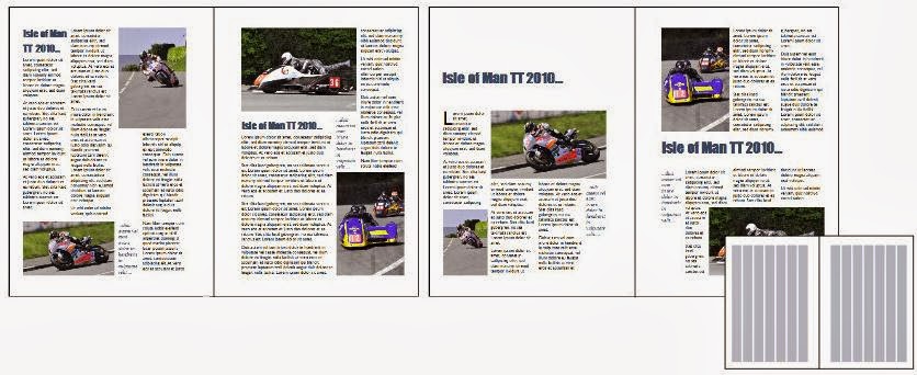
image3
II-b- Asymmetrical grids.
II-b-1- Basic
three-column symmetrical grids.
This sample is a simple grid consisting of three correspondingly
sized columns, it displays text columns and images in a good-looking, and also conventional
planning. Here some elements can occupied multiple columns (red part).

image4
II-b-2- Asymmetrical grid with sidebar
Asymmetrical layout allow us to use a thin ‘sidebar’. This one isn’t used for main body copy, but in its
place holds connected text (headings, pull quotes, notes, and so on). It may
also hold graphics, or simply white space.
The list bellow defines some common uses of the sidebar:
·
To show headings: in the
sidebar column, headings showed support to establish documents and enable the
reader to rapidly scan the page to get information they need.
·
To highlight essential
information or quote.
·
To hold information that
is related to the central topic of the body, but not part of the main text flow.
For example, note, idea, or warning.

image5
III-B-
Template
A template includes repetitive or
repeated elements most of the time visible to the audience. Using a template to
arrange elements usually involves less graphic design skill . Templates are
used for minimal modification of background elements and frequent modification or
swapping of foreground content.(July
2013).
III-C-Dynamic
Paul Andrew (July15,2013) states that “Dynamic
layouts cleverly and seamlessly arrange content into the grid”.
IV
Letters
used as focal point of a layout.
Even a single letter can
be successfully used as the focal point of a layout, particularly if It related
to content and has an engaging graphic form. Since letters are omnipresent in
our lives, they almost always attract our attention. The cover design by Jeff
Neumann for the entertainment tabloid Wild Life features the historical letter
style known as black letter or, more accurately.
The subject of Neumann’s
cover is The Scarlet Letter, a contemporary Hollywood version of Nathaniel
Hawthorne’s novel of 1850. Neumann unusually minimal layout is surprisingly
sophisticated for this type of tabloid: the title of the film and the graphic
form are completely integrated ( the primary graphic form is the scarlet letter
A of the tittle, forcibly worn on the
breast of the protagonist as public castigation for adultery). The scarlet
letter A is placed dramatically against a solid black background, the red glow of
its outside edge reinforcing the heated moralistic theme of the film.
Although a successful cover design
could be made with just the glowing letter, a layer of content was added to the
solution by making images of the actors inside the letterA, adding a human
element to the cover. Additionally the letter’s profile against the black
ground creates a keyhole through which the reader voyeuristically observes the
central characters, enhancing the film’s controversial subtext regarding moral
judgment and sexual behavior.

(Jeff Neumann ,193?) image6
V-Conclusion
Layout design help us to know exactly how to plan our job, by using grid, template and also dynamic layout, we may know in which way and in how many part we will like to arrange our design whether it is cover page design, news papper or web page.
References:
References:
No comments:
Post a Comment
Note: only a member of this blog may post a comment.