Tuesday, 24 September 2013

Page Layout

CONTENT                                                                             PAGE NUMBER
1.0 Introduction                                                                                  1
1.1  Alignment                                                                                     2
1.2  Contrast                                                                                        3 - 4
     1.2.1        Manipulation of space                                                               
     1.2.2        Typography
     1.2.3        Positioning in Elements
     1.2.4        Colors      
1.3  Proximity                                                                                      5-6
1.4  Repetition & Consistency                                                             7
1.5  Stability & Balanced                                                                     8
     1.5.1  Symmetrical Balance
     1.5.2   Asymmetrical Balance
2.0 Lesson Learn & Reflection                                                           9
3.0 References                                                                                    10


1.0   INTRODUCTION
Multimedia application is an application uses variety of gathering present in media resources such as graphics, text, pictures, audio or video. Following is a background study about Design Principles for Multimedia Application. Design principles such as alignment, proximity, contrast, repetition and stability as well balance is essential in developing an application. Moreover, applying these principles could make more nourishing and effective design.

1.1 ALIGNMENT
The principle of alignment in designing and developing a multimedia application is overall about positioning of text or graphics to the left, right, or centre of a page (Technical Aspect & Design Principles, 2013). Alignment is important in a design, as it will merge the selected text and graphics and makes it more organized, attractive and readable to the audience. Mainly alignment is used to create order, organize page elements, group items and create visual connections. Examples of alignment that can be used to create an eye-catching multimedia application are, horizontal, vertical, left, right, edge and centre. Visual or Optical alignment helps the designer to solve some problems that can happen with other types of alignment due to the varying shapes of letters and graphics (Bear, J. 2013). It is to be said that good alignment is invisible when every element is lined up neatly. Inserting too much of alignment could affect the readability as well creates unorganized look. If the designer found difficult to do alignment for a complicated layout, it is recommended to use guidelines and grids aid in the grouping the elements. Following figure 1.0.1, is an example of good and bad aligned design. 


      Figure 1.0.1 Comparison between aligned designs


1.2 CONTRAST
     Contrast is one of the interesting and simplest design principle which means difference. The contrast present in a design is known as its energy or the unique within the design. Although we are not conscious of it, our brain always scans the similarities and the differences in a picture (Reynolds, 2008, pp. 153 – 163). In short the more the difference, the more the contrast. This is because contrast is the way of stressing parts of a layout or controlling the readers' eye to specific areas of the page (Bear, 2013).
Contrast in a multimedia application can be applied in different ways, for example, through the manipulation of space, the choices of colors, usage of typography, positioning the elements and so on (Reynolds, 2008, pp. 153 - 163).

1.2.1: Manipulation of space
     Manipulation of space in an application indicates how much do the space given among the elements, whether it is near, far, empty or filled. So designers must not insert too much of texts or graphics in the application or else the audience may find it difficult to understand the point of the application.

 1.2.2: Typography
     Using different type of text such as serif, sans serif, bold and narrow with different font style can create contrast. However, too many style or font type in a single application can make the audience confused. At the same time, it is good to avoid using all bold and capitalized texts in the application to show the contrast among the different texts.

1.2.3: Positioning the Elements
     All the texts and graphic in the multimedia application need to be aligned according to the audience needs. At this stage, the elements can be positioned at the top or bottom and isolated or grouped. Furthermore, movement of the objects in an application also can make it look attractive or messy. So designers need to consider the balancing of objects during the development of the application.

         1.2.4: Colors
     Moreover, designer should be clever in choosing the colors for their design. Before applying, they must compare whether dark, light, cool and warm colors are suitable for their application theme. Most importantly, it is advisable to select background colors that show contrast with the font colors (Chance, 2005, pp. 10 – 34). Figure 1.0.2 is an example that shows the contrast in colors of a design.


Figure 1.0.2:  Color contrast in a design

1.3 PROXIMITY
       Proximity design principle in multimedia application means arranging elements closer or farther to create a well-organized look. In other words, the related items in that particular application are grouped together by moving physically. This step is significant because if the information were presented well organized, the more the consumers are likely to remember or read it (Universitydirectories.com, 2013). However, arranging the elements in the application sometimes could be tricky.

      For example, the application may look cluttered or confusing to the audience if the objects are moved too close to each other. On the other hand, objects which are moved too far are a weak design in an application. So it is important to make a connection between the objects and to the audience. Following is a figure showing the comparison between a good and bad proximity design:


      Figure 1.0.3: Comparison between Proximity Designs

This proximity or assembling of objects can be done with observable spacing, by assigning physical barriers, the use of color, shape or even the texture to group or separate the like and unlike items (Glossary, 2013). Besides, to develop a multimedia application with an appeal and clarity, it is essential to consider the method called ‘White Space’. White Space is the consideration of unused areas in an application. It is advisable to not crowd with too many of texts or graphics. Figure 1.0.4, shows an example of White Space method  (Chance, 2005, pp. 10 - 34).


Figure 1.0.4: White Space Method


1.4 REPETITION & CONSISTENCY
The design principle repetition is often paired with consistency and it is considered as reusing of same objects or graphics throughout in a multimedia application. Use of this principle could enhance the unity, cohesiveness and the consistency of a design. Design elements such as colors, graphics, layout, lines, alignment and typography are usually used to improve the consistency during the development of the design (Technical Aspect & Design Principles, 2013, p. single page).

However, we must ensure that we do not insert too much repetition in the application. For instant, using different colors can make the application unbalanced or messy, so to avoid this, a theme color can be chosen. As a whole, the important elements in the application will be emphasized (Reynolds, 2008, pp. 153 – 163). Besides, various types and sizes of fonts also give a disorganized look, because of this serif fonts are being used to make it look consistent. Being aware in using repetition can produce harmony in the design.  Following Figure 1.0.5, is the same image which undergone repetition of graphic treatment by creating consistency.


Figure 1.0.5. Example of Repetition
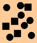
1.5 STABILITY &  BALANCE
Stability in a design often refers to balance and vice verse. A design with elements which are inflexibly fixed could create a stable layout. As a result, audience will be comfortable with the balanced design. Therefore, principle of balance is always measured in multimedia application designing (Park, 2007, pp. 25-68). The main principles of balance are Symmetrical and Asymmetrical.

1.5.1: Symmetrical Balance
  Both sides from the center of the design vertically and horizontally are identical or flawlessly centered composition like mirror image. Its visual position must be considered relative to the others in order to balance one design component with other design components (Bear, 2013).


Figure 1.0.6: Example of Symmetrical Balance design

1.5.2: Asymmetrical Balance
             A stable design is created with off-centered or with mismatched elements without spoiling the layout balance. Asymmetrical balance can generate an energetic and attractive impression which symmetrical does not. The sense of variety present in this design makes it look striking. 


Figure 1.0.7: Example of Asymmetrical Balance Design

2.0   LESSON LEARN & REFLECTION
Overall from the background study, I learned that design principles are very important to be considered during designing and developing a Multimedia Application. Moreover, organization could be done before designing any applications. Making detailed outline with information chronologically for the application which will be designed. Next, develop the design according to the audience needs or to topics. In this process, Story Board is essential as it helps to collect ideas and plan throughout the process. 

Three main things should be highlighted in Multimedia Application designing process, which is clear, consistent and contrast. The appearance of design always affects the way we distinguishes it. A design should have a good communicability and clear for the audience to read and understand the message in the application. To make the designs clean, avoiding adding too much of information is best. The hierarchy should be seen clearly. Furthermore, a designer at first need to have constant mental adjustment, so that he/she could come with ideas in this current constantly changing environment. Contrast in a design makes it unique, which draws the attention of the audience. It aids to produce strong active differences among the objects present in the application. In conclusion, these design principles: Alignment, Contrast, Proximity, Repetition & Consistency and Stability & Balance plays major role in creating an impressive Multimedia application. The more striking the application designed, the more the audience will be satisfied.


 3.0 REFERENCES
Bear, J. 2013. Alignment. [online] Available at: http://desktoppub.about.com/od/designprinciples/a/alignment.htm [Accessed: 18 Sep 2013].

Bear, J. 2013. Repeating Elements for Page-to-Page Consistency. [online] Available at: http://desktoppub.about.com/od/designprinciples/ig/Principles-of-Design/Repetition---Patterns.htm [Accessed: 18 Sep 2013].

Chance, D. 2005. Multimedia Design Principles. [e-book] pp. 10 - 34. Available through: Google Scholar http://web1.arthurphilh.schools.nsw.edu.au/~tas/Multimedia/Website/Term4/Resources/designprinciplesMM.pdf [Accessed: 15 Sep 2013].

Desktoppub.about.com. 2013. Balance - Lessons on Balance in Page Design. [online] Available at: http://desktoppub.about.com/od/designprinciples/l/aa_balance.htm [Accessed: 18 Sep 2013].

Glossary, J. 2013. Proximity. [online] Available at: http://desktoppub.about.com/od/glossary/g/Proximity.htm [Accessed: 18 Sep 2013].

Howard Bear, J. 2013. Principles of Design. [online] Available at: http://desktoppub.about.com/od/designprinciples/Principles_of_Design.htm [Accessed: 20 Sep 2013].

Park, J. 2007. Visual communication in digital design. Seoul, Korea: YoungJin.com.

Reynolds, G. 2008. Simple Ideas on Presentation Design and Delivery. [e-book] pp. 153 - 163. http://www.presentationzen.com/chapter6_spread.pdf [Accessed: 18 Sep 2013].

Technical Aspect & Design Principles. 2013. [e-book] p. single page. Available through: Google Scholar http://www.edb.utexas.edu/minliu/multimedia/technical.swf [Accessed: 14 Sep 2013].

'Universitydirectories.com. 2013. Use Design Principles to Create Better Ads | University Directories. [online] Available at: http://universitydirectories.com/2013/04/designing-an-effective-advertisement-102/ [Accessed: 17 Sep 2013].


Layout design by group6

Layout design by Hong Zhang (group 6)

Define layout design

Layout, also known as layout design, graphic design of a large branch, mainly refers to the use of modeling elements and forms of principle, the layout inside the text font, images, graphics, lines, forms, color and other factors, in accordance with certain requirements for choreography and visual arts to express way and through the presentation of these elements make the viewer feel some intuitive meaning to pass.
Layout is not only used for typesetting books among web pages, advertisements, posters and images related to the plane will be used in many areas of the layout. Good layout can better convey the author wants to convey information, or to enhance the effect of information transmission, and can enhance legibility, so after the layout is much more eye-catching and beautiful. Layout design is the art technology combined with ideas and choreography work, the unity of art and technology.

Design layout step

1) Conceive and draw sketches. There may be a number of sketches alternative.
2) Select the design draft. Select from a sketch or a few closer to the design requirements, and further depicts its details.
3) Artwork. After selection of the final design, will be starting to design, layout, drawing and others.
4) Sample. Finished the layout design should be make a sample and check the layout design. If an error occurs, it can go back previous step to continue to modify, and make sure the layout design is perfect.

Grid of Layout design

Also known As the Swiss design. Grid layout is a graphic design method and style. That is using fixed of grid layout, the style simple and neat. After World War II, This style of layout design becomes most popular and mainstream style of publication design.

Basic grid design

Two-column grids: (Most popular type)

Two-column grids are very simple and most using in magazine and newsletters.

However, in popular publications, landscape of two-column grids be too wide to reading and given reader a feeling of comfortably.


Three-column grids:

Three-column grids more agility to design the layout, because the picture can use one column, two column, or all of the column.


Four-column or above


If you have many picture, text, and graphics, this style of column more flexibility and more place to insert.


Example

The following picture is four-column grid design.
The first three-column is about the topic, and last one column is contact author
But the users can manual scroll horizontally to read the topic.


When you click the menu button, the all page will move to another page, such as flash motion.
http://melissahie.com/


This layout design is creative layout.
The author is using when your mouse move to the number or abc, the selected of project will hang in the air.
http://www.jeremylevine.com/


creative ideas. Open this website, move the mouse to black card there, the black card will auto fly away. And then click the "1561" card, some of card will fly out and some of card stand the floor. It is interesting of layout.
http://www.seymourpowell.com/flash/


References
Page Layout Design ,[online] Available at: <http://www.serif.com/appresources/ppx5/tutorials/en-gb/tutorials/design_grid.htm/>[Accessed 22rd September 2013]

Grid (graphic design)  ,[online] Available at: <http://en.wikipedia.org/wiki/Grid_(graphic_design)/>[Accessed 23rd September 2013]

Vitaly Friedman,40 creative design layouts:Getting out of the box  ,[online] Available at: <http://www.smashingmagazine.com/2008/09/03/40-creative-design-layouts-getting-out-of-the-box//>[Accessed 24rd September 2013]

Design Principles

DESIGN PRINCIPLES
                                     For multimedia application


                                  Design
"What is design? A plan for arranging elements in such a way as to best accomplish a particular purpose." - Charles Eames (Donna Tersiisky, 2004 cited in Faimon & Weigand, 2004, p.13).
A design is created with elements of line, shape, color, value and texture that are put together using the principles of balance, emphasis, unity, proximity, and variety (Donna Tersiisky, 2004 cited in Brainard, 1998, p.4). I am going to briefly discuss about the principles of balance, emphasis, and proximity.


                              Elements
The elements of design are the building blocks of design. “Elements are like the ingredients in a recipe (Donna Tersiisky, 2004 cited in Faimon & Weigand, 2004, p.13), the parts of a machine (Donna Tersiisky, 2004 cited in Evans & Thomas, 2004, p 4) or the notes in music. On their own, these elements may do little, but put together skilfully, they create a cake, a car or a concerto.”
According to (J6 design, 2011), the elements of design are as following:
  • LINE - The linear marks made with a pen or brush or the edge created when two shapes meet.
  • SHAPE - A shape is a self-contained defined area of geometric like squares and circles, or organic like free formed shapes or natural shapes.
  • DIRECTION - All lines have direction like Horizontal, Vertical or Oblique.
  • SIZE - Size is the relationship of the area occupied by one shape to another.
  • TEXTURE - Texture is the surface quality of a shape whether is it rough, smooth, soft hard, glossy and many more.
  • COLOUR - Colour is the light that is reflected off objects.


                             Principles
The principles of design are the guidelines that are used for putting elements together to create effective communication (Donna Tersiisky, 2004 cited in Brainard, 1998, p.92). The elements are categorised as the ‘what’ of a design and the principles are categorised as the ‘how’ (Donna Tersiisky, 2004 cited in Faimon & Weigand, 2004, p.25). “Using the recipe metaphor - the elements are the ingredients and the principles are the directions.” (Donna Tersiisky, 2004)The principles of design are difficult to separate from one another. An effective design is created only when they are working together.


1.     Balance
“Try walking a long distance with a 2 pound bag of rocks in one hand and a 10 pound bag of marbles in the other. After a while you will want to shift your load around, putting a few marbles in the rock bag to balance your load, make it easier to walk. This is how balance works in design.” Visual balance achieved by either arranging elements on the page so that no one section is heavier than the other or by arranging the elements out of balance to create tension or a certain mood. (Jacci Howard Bear, 2011.). There are five types of balance. They are horizontal balance, vertical balance, radial balance, symmetrical balance, asymmetrical balance.


Horizontal and Vertical Balance
Vertical and horizontal balance is where objects are balanced left and right (horizontal) and top to bottom (vertical) of central axis (Patrick Cox, 2011).


Examples of Horizontal Balance:


Examples of vertical Balance:


 Example of Vertical & Horizontal Symmetry:


The shape in this design divides into four equal sections. Although it is not mirror images but they are similar in shape and the overall look is very symmetrical and balanced (Jacci Howard Bear, n.d.).


Radial Balance

Elements can also be balanced off of a central point. Basically, elements will be located around, like elements are coming out of central axis point (Jacci Howard Bear, n.d.). (Refer to ex.2)

                                                                                Ex.2


                                             Example of Radial Balance 1


                                              Example of Radial Balance 2


Symmetrical and Asymmetrical Balance

Symmetrical and asymmetrical balance is a type of balance that combines vertical, radial, and horizontal. (Jacci Howard Bear, n.d.).
Symmetrical also called as formal balance is mirror image balance. They may not be identical objects, but they are similar in terms of numbers of objects, colors and other elements (Bonnie Skaalid, 1999). (Refer to Ex.3).


                                                            Ex.3


 Sometimes they are completely identical and it is often seen in architecture. (Bonnie Skaalid,1999).


On the other hand, the items in asymmetry are balanced but not by identically or similarly to each other. It is probably the most common interesting form of balance than symmetry. 
However, asymmetry does not mean there is zero balance in the composition but it’s just that the elements are not positioned in carbon copies of each other (Jacci Howard Bear, n.d.). (Refer the examples below)


Examples of asymmetrical balance:


Examples of symmetrical and asymmetrical balance :


2. Emphasis
The principle of emphasis is used to create dominance.  Dominance means it is dominating (noticeable) than other elements (Yangjoo Park, n.d.). There is usually a focal point which will draw the attention to the most important element on the page. There are several techniques used to emphasize the most important object on a page (Bonnie Skaalid, 1999).  When   some things get more attention, some get less. Those are subordination. Three major methods are controlling emphasis. They are contrast, placement, and isolation (Yangjoo Park, n.d.).

CONTRAST
Contrast can be simply defined as difference. The objective of contrast is to produce maximum prominent to an item. The more contrast an object is the more prominent it will be. Contrast in a work is achieved by size, shape, and color/value (James T. Saw, 2001).
Color/Value: Color contrasts are usually less strong than value contrasts. Dull colors are less attractive than bright colors. Bright colors attract the attention.  Strong value contrast should be used to make something stand out. For example:


The first, (dark) & violet bar, is clearly visible against the white background but barely visible against the black. The second, (light) bar’s and the two yellow bars’ contrasts are the opposite (visible against the black background. The third (gray) bar is equally visible against both black and white but has low contrast. The black to white (fourth) bar has maximum contrast at either end.The two red bars are middle values and contrast well. However, the brightness of the red makes it more visible (James T. Saw, 2001).


                                                              Ex.4
Notice that in Ex.4 we can “see” the red color wording easily because of hue contrast but all of other words are easier to “read” because of value contrasts.


 Examples of color/value contrast:


Size:  Bigger is always better when it comes to being noticed. The bigger the size the more noticeable it will (James T. Saw, 2001).

Examples of size contrast:


Shape: A geometric shape will be noticeable when the rest of the items are irregular (Bonnie Skaalid, 1999). The reverse is also works. But the contrasts of shapes are not as strong as color/value or size contrasts (James T. Saw, 2001).


Examples of shape contrast:


PLACEMENT
Placement (where the item is) of items in relation to the format and each other can affect emphasis.

                                                            Ex.5
 Refering to Ex.5, Center (1) is the prominent place. Center point is where a viewer’s eyes will look into first. (2) creates attention by overlapping to the edge. It appears like coming in or to be going out of a composition but it only works when the design is clear and simple. It is also can be used to show an item is in the front of a design. A focal point should be determined in order to use similarity, continuance, and proximity relationships to decide the next noticeable item (James T. Saw, 2001).

Proximity: An overlapping, touching or close to primary object is likely to be seen next in that order. The more contrasting the object is, the more likely this is to happen. The placement of objects is important (James T. Saw, 2001).


Similarity: An object with the same color, size and/or shape will form a group with the primary object and be seen next. The stronger the link when the more alike the two objects are. Texture can be also an effective similarity device (James T. Saw, 2001).

Continuance:  Continuance can be described as a device for directing the viewer's attention when looking at a composition. When the main item points another item, automatically that item will become secondary.


Refer to the example shown below. All will notice the small circle that the hand points at in preference to the closer, larger circle (James T. Saw, 2000).


ISOLATION
Isolation is also a kind of placement. An object is separated from grouped objects. This technique is use to make an object to be prominent; not to be seen first (James T. Saw, 2000).


In the above example, the circle in the group will be seen first but the ‘one circle’ will stand out (James T. Saw, 2000).


3. Proximity

Proximity can simply define as closeness. Proximity creates a bond between people and between elements on a design. How close together or how far apart elements are placed suggests a relationship. Unity is also achieved by using a third element to connect the distant parts.There are four types of proximity relationships. They are close edge, touch, overlap and combining (About.com, n.d.).


Close edge
Proximity simply means when few items are close to each other, they will be seen as a group (James T. Saw, 2002).


In the above example, the 14 objects form 3 groups but a small circle which is at the bottom seem to be not in the grouping (James T. Saw, 2002).


Be happy
This type of grouping widely used with printed kind. The two word ‘Be’ and ‘happy’ in the example above, can be easily identify as 2 different words due to the space in between them (James T. Saw, 2002).


B e . h a p p y
Previously the space that has been used in between ‘Be’ and ‘happy’ is now used in between of each alphabets and double space is used between the two words (James T. Saw, 2002).


FREE . . . .WATER
FOOD
 .. . .. SOLD
We usually read words from left to right but also from top to bottom. The close edge relationships can form groups in any direction. Refer to the example above.
                                            

Example of close edge 


Touch


Items touch when they get close enough. It should be noted that they are only seem to be together but they are still different objects. Close edge grouping are less strong than the one which is overlapping. The shape relationships are more noticeable because there are no size differences (James T. Saw, 2002).

                                                    Example of touch


Overlap


In above example, the use of two colors highlights the overlap. When single color is used the overlapping cannot be seen clearly. It will look like a formation of different shape and the overlapping is not visible. When it comes to hierarchy of grouping, overlapping is the strongest followed by two different color, single color, touching, and lastly close edge (James T. Saw, 2002).
                                                    Example of overlap


Combine

An eternal element can be used to group various items together. A simple is when we underline few words. The underline will group the words together. In this case ‘underline’ acts as combining device (James T. Saw, 2002).


In the example above, the black and red squares combine the objects and grouped with the big square. These are the one which stands out at last (James T. Saw, 2002).

Example of combine (the alphabets are combine by the background) (James T. Saw, 2002).


                Conclusion

In conclusion, this assignment has really helped me to know various facts about the design principles for multimedia as whole.
First of all, we should plan the hierarchy how the content should be seen. The appearance of information (whether in the form of text or graphics) effects the way we perceive it.
I will apply the three principles (principle of balance, emphasis, and proximity) in my group assignment. I think all three principles are essential for the group assignment. Balance is the main which gives an impression of steadiness to a design. Too much of items in a single design will be overcrowded and confusing. It is very important to make sure the distribution of visual weight is equal in a design. The balance should be reached in way of vertical, radial, horizontal, symmetrical or asymmetrical balance.
The next principle that I will apply in my design is emphasis. This principle is vital because it will allow one particular element in the design to stand out and will emphases the message that me and my group members wanted to convey by the design. This principle can be placed on any important aspect of the design. The organization of visual hierarchy is significant to decide which one is most important and should be more visible to the least by using the either methods of contrast, placement, or isolation.
The following principle that I will use is proximity. This principle will able a relationship between two graphic or non-graphic objects based on their distance from each other and their linkage through a third object by using either type of the following: close edge, touch, overlap and combining.


Although design can be divided into many principles, all the principles need to work together to form a successful design.
 I will contribute my best, cooperate with my group members to do my group assignment with the knowledge that I gain from this assignment to make sure all the elements of design are well balanced, working together, and eye catchy.


                            Reference

Donna Tersiisky, 2004. The Elements and Principles of Design. [Online] Available at: <http://nwrain.net/~tersiisky/design/design.html> [Accessed 17 September 2013].

J6 design, 2011.6 Principles of Design. [Online] Available at: <http://www.j6design.com.au/ClientArea/6fundamentalprincipleofdesign>[Accessed 17 September 2013].
Jacci Howard Bear, n.d.. Principles of Design. [Online] Available at: <http://tympanus.net/codrops/developing-balance-in-web-design/> [Accessed 18 September 2013].

Patrick Cox, 2011.Developing Balance in Web design. [Online] Available at: <http://tympanus.net/codrops/2011/09/13/developing-balance-in-web-design/> [Accessed 18 September 2013].

Bonnie Skaalid, 1999.Classic Graphic Design Theory. [Online] Available at: <http://www.usask.ca/education/coursework/skaalid/theory/cgdt/designtheory.htm > [Accessed 19 September 2013].

Yangjoo Park, n.d..Design Elements & principles. [Online] Available at: <http://www.edb.utexas.edu/minliu/multimedia/PDFfolder/DESIGN~1.PDF > [Accessed 19 September 2013].

James T. Saw,2001.Emphasis. [Online] Available at: <http://daphne.palomar.edu/design/emphasis.html > [Accessed 20 September 2013].

James T. Saw,2001.Using Value. [Online] Available at: <http://daphne.palomar.edu/design/value/UseVal.html > [Accessed 20 September 2013].

James T. Saw,2000.Gestalt. [Online] Available at: <http://daphne.palomar.edu/design/gestalt.html#anchor1130271> [Accessed 21 September 2013].

About.com,n.d..Principles of Design. [Online] Available at: <http://desktoppub.about.com/od/designprinciples/l/aa_pod1.htm > [Accessed 21 September 2013].
James T. Saw,2002.Similarity And Proximity. [Online] Available at: <http://jimsaw.com/design/simnprox.html> [Accessed 22 September 2013].