Content
Introduction
The Human Computer
Interface In Apple IOS Application
User
Interface Principles
•The beauty of the overall
• Operation directly
User
Experience Guidelines.
• Consider the sequence
• Make everything easy and obvious
• Use the terminology that can be understood by users
Reference
Interactivity in multimedia application
Introduction
The term
"look and feel" is often used to refer to the specifics of a computer
system's user interface. Using this metaphor, the "look" refers to
its visual design, and the "feel" refers to its interactivity. Every
action in your mind after understanding the user interface means you are
communicating with the system. That is interactivity. Indirectly this can be
regarded as an informal definition of interactivity.
In computer
science, interactive refers to software which accepts and responds to input
from humans—for example, data or commands. Interactive software includes most
popular programs, such as word processors or spreadsheet applications. An
essential feature of interactivity is that it is mutual: user and machine each
take an active role. Most interactive computing systems are for some human
purpose and interact with humans in human contexts.
The Human Computer Interface In Apple IOS Application
User Interface Principles
A good man-machine
interface specification compliance the way that users' thinking and action, and
not depend on the device performance. An user interface which is unattractive
and complex will make a good application become worse than before. Otherwise, a
beautiful and intuitive perception interface can strengthen the functionality
of the application and also can encourage users.
•The
beauty of the overall
The beauty of the overall,
is not simply refer to how beautiful the application interface, but rather whether
the appearance and functionality of the application combination perfect. For
example, to deal with the task applications usually simplifies the decorative
UI elements and put it in the background, so that give the task itself an
important position. Then the users can easily understand the aim and the
feature of the application.
•
Operation directly
When the user can
operate the objects in the screen directly and no need to use other control to
operate, they will be interested in the task itself more easier than before.
And also more easier to understand the result of the operate. Multi-touch
technology allows iOS users to experience the convenience of operation
directly. By using touch screen, the user will have more kindly with the user
interface and more sense of control. Because of the users do not need some
other devices, like mouse.
In an iOS application,
the following ways can allow users to experience the direct operations:
--- By rotating or
moving device to affect the screen objects
--- By using touch
screen to control the objects which in the screen
--- It seems that
to see the result of the operating very soon
User Experience Guidelines.
•
Consider the sequence
Top of the screen
is the most likely to be noticed by the user's. User holding the device,
usually has the following ways to interact:
--- Use their not
used hands to hold, use the most used fingers to operate.
--- Use one hand
to hold, and use its thumb to operate.
--- Between two
hands, and use two thumbs to operate.
Put the most
frequently used information on the top of the screen, there is most likely to
be found. When users access the screen from top to bottom, showing the
information should be from the general to the particular, from the high level
to the low level.
•
Make everything easy and obvious
You should try to
let your application be understood more easier, because you are not sure
whether the user want to spend time to research it. Straight to show the core
functions by using the following ways:
--- Reduce the
controls which need users to make choices
--- Rational use
of standard controls and gestures, and pay attention to maintain consistency
--- Control labels
need to be clear, so that the user can clearly know what they are doing
•
Use the terminology that can be understood by users
When use the text
to communicate with the users, try to use the terminology that can be
understood by users. Especially, try to avoid to show some technical speech in
the user interface. Because most people like to see the sentences which is
simple and concise. These can make them feel comfortable. From the user's point
of view to consider whether the words used by apt.
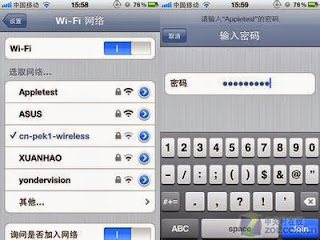
For example, Wifi
network settings interface will use simple words to explain.
Reference
Dix, Alan; Finlay,
Janet; Abowd, Gregory D.; Beale, Russell (2004). Human-computer interaction.
3rd edn. Pearson Education. p. xvi. ISBN 0-13-046109-1, 9780130461094. Check
|isbn= value (help).
<Interactivity>
http://en.wikipedia.org/wiki/Interactivity#Computing_science
http://en.wikipedia.org/wiki/Interactivity#Computing_science
Rada, R.; Michailidis, Antonios (1995). Interactive media. New York: Springer-Verlag. p. 12. ISBN 0-387-94485-0.
"Improving interactivity with Javascript". Friendly Bit. Retrieved 2011-10-28
"Improving interactivity with Javascript". Friendly Bit. Retrieved 2011-10-28


No comments:
Post a Comment
Note: only a member of this blog may post a comment.