Introduction to Layout Design
1.0 What is Layout
Layout is a very important issue in order to create or design a graphic design. This is because layout is a bulletin of content, which consist of the two main element, which are proximity and the sequences. Proximity is refer to the arrangement of the information or elements in the page, and the sequences is the placement of the material such as image and text.An effective layout can help the user to easily understand the general information that provided in the bulletin .Besides that it also can let the user find out the specific information or the details more effectively, which means that by using an effective layout, it will be very easy to let the reader get the information from the layout. By using an effective layout is not enough to attract readers, it must be have something special such as image and colour to get attraction from the readers.
If the designer does not understand the layout, there are a big possibility that the designer may lead you waste a lot of money in the advertising cost, because the important message that the client want to be convey to the public might be lost. A proper layout can enhance the look of particular object.
1.1 Attributes to have effective layout
An effective layout should have 8 attributes:-Focus
Focus is means that the main point that required the attention from the user to look the main point in their first sight.
-Flow
Flow is means that the design should be in order so that the reader can go through the layout smoothly and readers can obtain all the information at the layout.
-Grouping
Grouping is refer to all the related item should be grouped together and the unrelated item should be separate from those group.This is to let the user easily to find out their needs.
-Emphasis
The related item that have been grouped together and emphasis them based on their relative importance.
-Alignment
Designer should put the element coordinately to ensure all the element can be appear orderly.
-Easy to scan
User can easily find out the information that they need.
-Balance
The design in the layout should be balanced in the design.
-ConsistencyThe designer should use same layout in the similar pages, so that the user will not feel uncomfortable when using it. Because some of the user might think that they have reached a totally different webpage.
The example of layout that is consistency:

Figure 1.1
Figure 1.1 shows that the consistency of the layout.
2.0 Type of Screen Layout design
There are few types of screen layout design, and the most common used screen layout design is grid layout design and path layout design.
2.1 Grid Layout
Grid Layout is one type of graphic design, it also can consider as one good design that most commonly used as screen layout design. "A grid subdivides a page vertically and horizontally into margins, columns, inter_column spaces between block of type and images." .Grid layout design can be separate in two different layout, one is horizontal and one is vertical. By using grid as layout design, the screen can enhances the virtual experience of visitors. This is because visitors will recognizing the pattern of the screen layout in their mind when they are surfing a website that were designing in structured and balance. Besides that, The designer also can do some maintenance on the website such as upgrading the design in consistent way. This actually will help the designer to reduce their time when they do the maintenance on the website.2.1.1 One Column Grid
One column grid is a normal page layout, the simplest grid consist of a single column of text that surrounded with margin. Layout program will encourage user to design their page in two ways normally, either outside in or inside out. By design the page using inside out or outside in, user will experiment the changes in margin and column, which will not let the user always use the default setting in the word program.

The grid layout that in the figure 2.1.1.1 is a grid layout that are designing in spreads. Normally the books and the magazine are using this kind of design.
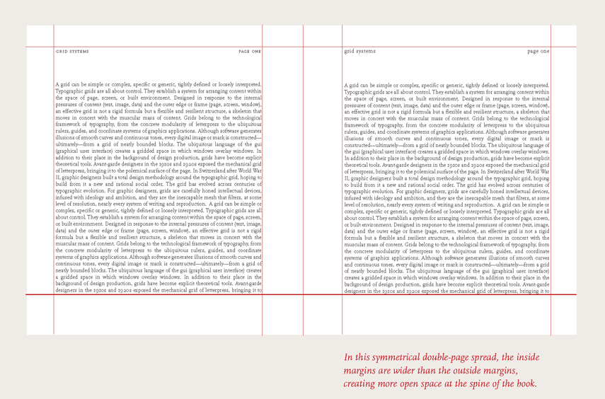
Figure:2.1.1.2
The grid layout that in the figure 2.1.1.2 is show that the symmetrical double page spread. The margins that placed inside are wider than the margin at outside. The purpose of doing this design is to creating more open space at the spine of the book.
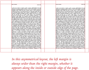
Figure:2.1.1.3
The grid layout that in the figure 2.1.1.3 is another type of design. This design is the margin at the left side will always wider than right margin, no matter the margin is appears along the inside or outside edge of the page.
2.1.2 Multicolumn Grid
The single column grid that have explain in above will be work well in simple document. "Multicolumn grids can provide flexible formats for publications that have complex hierarchy or integrate text and illustration."
Example of Multicolumn grid:

Figure:2.1.2.1
The grid layout that in the figure 2.1.2.1 is show that the first column grid have been reserved to put in image and caption, the other column will be put in the details and information, either to explain a product or explain some information at there.
"In case we are using grid design that are creating the vertical zones with the column grid, user can also divide the page using horizontal grid. "

Figure:2.1.2.2
The grid layout that in the figure 2.1.2.2 shows that the horizontal band divide text zone from image zone.
2.1.3 Modular Grid
Modular grid is a grid layout design that has consistent horizontal division and vertical division, from top to bottom and from left to right.
Example of Modular grid:
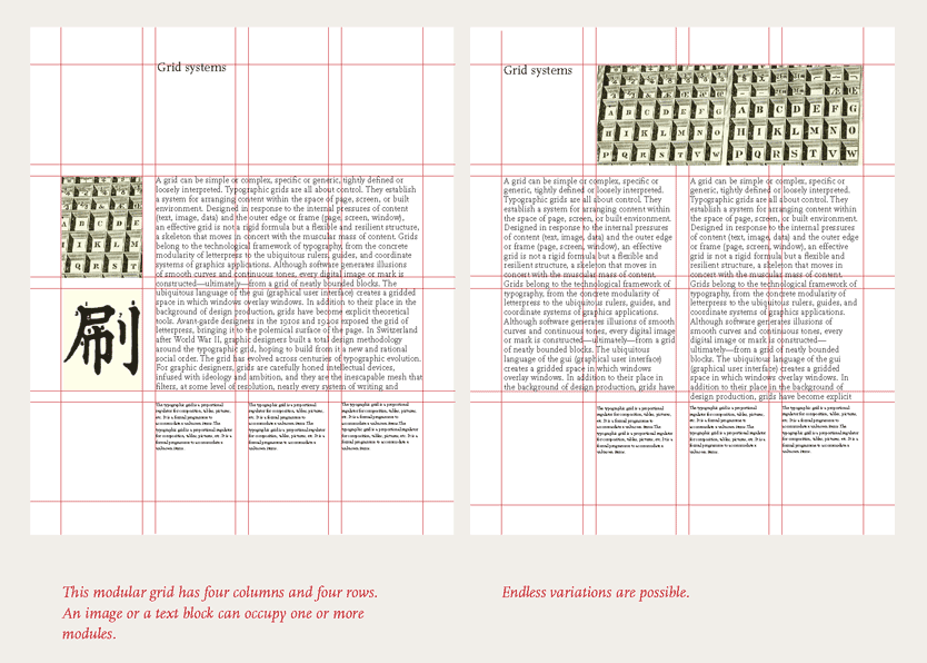
Figure:2.1.3.1
The grid layout that in the figure 2.1.3.1 is show that the modular grid has divide into four column and four row. An image can occupy in one grid, so that the readers can see the text and image easily.
2.2 Path Layout
Path layout is one type of graphic design, that use a motion likely to let the user to move on and see the content.
2.2.1 Z layout design

Figure 2.2.1.1: Z layout pattern.
This figure is show that how the readers view the content along the path that attach with numbering. When the reader's eyes follow the path of Z, it is call to action.Most of the designer will use the Z layout as a standard, they will follow the Z layout in order to do their design, the four core requirement to used Z layout design is branding,hierarchy,structure and call to action.Normally the logo will be at the first point when using the Z layout design.

Figure 2.2.1.2: webpage using Z layout design.

Figure 2.2.1.3: Explanation for figure 2.2.1.2.
2.2.2 F layout design

Figure 2.2.2.1 : F Layout Design.
A scientific do a research and show that most of the user that surfing internet to read document, they are reading the screen in F pattern, which means that the reader will see the top, upper left side then move to the upper right side. After finish read the top part, reader will move down to the middle part to see the content, then only will go move the down part.

Figure 2.2.2.2 : Screen Layout using F layout Design.
The figure above is a webpage that are using F layout design. Mostly the right side will have some advertisement that can promote some product to the readers or navigation to allow user to move to their favorite search

Figure 2.2.2.3 : Explanation for figure 2.2.2.2 .
The figure above is explaining how the F layout design is working.
2.3 Element having good layout design.
2.3.1 Colour
In order to design a webpage that are very effective, colour is one of the element that are very important. This is because whole webpage might be ruin due to the poor choice of colour. Besides that, the text colour should also be contrast well with the background design, so that the user can read the text.
2.3.2 Text
Font and font size in the layout design is also an element that can make the webpage more effective. The font size should not be fixed, this is because it can allow the user to change the value in their web browser, so that the user can read the text in their viewing ways.
3.0 Conclusion
Before conduct the research of graphic design and screen layout design, the author was thinking that it is very easy to design a screen layout which is putting all the information and the image onto it, and then arrange it in proper way.
After conduct the research about the screen layout design, the author have gain some technique in design an effective layout design. The technique that can design an effective screen layout is we need to learn how to implement the eight attributes of design , which are focus, flow, grouping, alignment, consistency, easy to scan, balance and emphasis into the real design. The author also learn about the two major types of screen layout design.
By conduct the background study of screen layout design, the author has some idea and plan to implement the technique that have learned in the background study into another assignment, which is using a grid layout and combine with a path layout. The reason that author choose this two layout is because the task in next assignment is re branding a product. The product have some different types of categories. So when using grid layout, we can categorized all the product into different group, such as powder, nugget, and etc. The author think that the using Z pattern layout can attract the user because the left side upper part will have the logo of the product, it can direct tell the user that which product is doing the advertisement like that.
4.0 Reference
1)A Brief History of Grids | Graphics.com. 2014. A Brief History of Grids | Graphics.com. [ONLINE] Available at: http://www.graphics.com/article-old/brief-history-grids. [Accessed 27 February 2014].
2)Designing Layouts. 2014. Designing Layouts. [ONLINE] Available at:http://www.andrew.cmu.edu/course/76-273/lectures/layout.htm. [Accessed 25 February 2014].
3)Understanding the Z-Layout in Web Design. 2014.Z-Layout in Web Design. [ONLINE] Available at: http://webdesign.tutsplus.com/articles/understanding-the-z-layout-in-web-design--webdesign-28. [Accessed 24 February 2014].
3)Understanding the Z-Layout in Web Design. 2014.Z-Layout in Web Design. [ONLINE] Available at: http://webdesign.tutsplus.com/articles/understanding-the-z-layout-in-web-design--webdesign-28. [Accessed 24 February 2014].
4)Layout In Graphic Design . 2014. What Is Layout In Graphic Design |. [ONLINE] Available at:http://www.designzbyjamz.com/importance-of-layout-in-graphic-design-materials/. [Accessed 20 February 2014].
5)Thinking with Type . 2014. Thinking with Type. [ONLINE] Available at: http://www.thinkingwithtype.com/contents/grid/. [Accessed 24 February 2014].
6)Why Layout is Important in Design?. 2014. Why Layout is Important in Design?. [ONLINE] Available at:http://arfatechnologies.com/graphic-design-blogs/why-layout-is-important-in-design/. [Accessed 26 February 2014].
My comments are:
ReplyDelete1. The content is well-organized with numbering, good for reading
2. No citation added in your report, so which reference does it refer to?
3. Should have the caption besides the figure number, do you know how to do?
4. good examples were used in the explanation to create better understanding
5. but if possible, i suggest to have more elaboration in the report
6. Good for expressing the new knowledge you learned and present some decision for the assignment 2, but yes, if possible it can be more in-depth
7. In Assignment 2, continue the discussion on your choice of layout design and reasons, create a section for this discussion, and emphasize it in your presentation.
8. Should arrange the reference list according to alphabetical order