Use of Colors in Graphic Design
1. Introduction
Color is very essential in our daily life. Color is
striking and eye-catching since they are so colorful. Color affects us in
various ways, neither mentally and physically. Besides, color can influence
people’s thought, alter movement and actions as well as cause reactions. Color
is unique for the reason that it is a powerful form of communication. For
example, traffic light sends the worldwide communication; red indicate “stop”
and green indicate “go”. All of these
are the color matters!
2. Color Wheel
 |
| Figure 2.0 Color Wheel |
The color wheel is the basic instrument for colors merging. In 1666, Sir
Isaac Newton was the first designer who designed the circular color diagram.
(Tiger Color, n.d.) A color wheel act as an arrangement of color visual
representation based on their chromatic relationship. Color wheel are divided
into three categories which are primary, secondary and tertiary.
Red + Orange = Red - orange
Red + Purple = Red - purple
Blue + Purple = Blue - purple
Blue + Green = Blue - green
Yellow + Orange = Yellow-orange
 |
| Figure 2.1 |
Primary
colors was shown in Figure 2.1. Red,
yellow and blue are considered as primary colors. These colors cannot be
formed by mixing others. (Courtney McMullen, 2012)
 |
| Figure 2.2 |
Figure 2.2 shows the
secondary colors. Secondary colors are the combination with two primary colors. (Courtney
McMullen, 2012)
o
Red + Yellow = Orange
o
Red + Blue = Purple
o
Blue + Yellow = Green
 |
| Figure 2.3 |
Figure 2.3 shows the
tertiary colors. Tertiary colors are the mixture of primary and secondary
colors. (Courtney McMullen, 2012)
Red + Purple = Red - purple
Blue + Purple = Blue - purple
Blue + Green = Blue - green
Yellow + Orange = Yellow-orange
Yellow + Green = Yellow-green
3.
Color Harmonies
Harmony is somewhat that is pleasant to the eye. Harmony forms an internal
sense of order and creates an equilibrium in the visual understanding. However,
It will become dull and disordered when something is not harmonious. Extreme unity
will lead to under-stimulation whereas over
difficulty will lead to over-stimulation. In short, harmony put emphasis on
balance. (J.L. Morton, 2014.)
Analogous colors
 |
| Figure 3.0( J.L Morton, 2014 )
Figure 3.0 illustrate the example of analogous. Analogous colors are any
three colors next to each other on the color wheel. Normally they are
well-matched and generate calm and peaceful strategies. Analogous colors always
found in the nature.
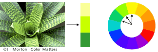
Complementary colors

Figure 3.1 ( J.L Morton, 2014 )
The example of complementary is shown on Figure 3.1. On the color wheel, two
colors which are directly contradictory to each other is known as complementary
colors. It is basically high-contrast and can pull maximum attention. According
to the figure 3.2, the yellow-green and the red-purple combined with sharp
color contrast with the maximum firmness. Complementary colors are difficult to use
in great amount. Nevertheless, complementary colors works perfectly when we want
something to be more out-standing and unusual.
Triad colors
|


Figure 3.2
Triad colors are the three colors which take on the color wheel. These colors are separate similarly. They form a triangular shape when the colors are link together. In this case, figure 3.2 is the example of the triad colors. This combination of color is visually attractive and well-balanced.
Monochromatic colors
 | ||||||||||||||||||||||||
| Figure 3.3
Monochromatic color uses a single color of different darkness. Through the
monochromatic color, several dimmer shades, grayer natures, and lighter tones
of the main color. In this case, figure 3.3 illustrate the monochromatic color only
uses one single blue color with different tone and darkness.
4. Colors Meaning
|
5. Examples in daily life
Nowadays, color is used as a symbolism because of logical value. The
features of a color is continuously determined by the other colors surrounding
it. We can understand the color easily for the reason that the interaction
between the colors themselves. There are some examples illustrate colors play an
important role in our daily life. We can refer to some of the successful logo
redesigns.
- Restaurants, Fast Food and Food Products (Rachel Arandilla, 2011)
 |
| Figure 5.0 |
 |
| Figure 5.1
Many of the companies that are focused on food and feasting use red and
yellow color which illustrate in the figure 5.0. This is because these colors
are eye-catching and easy to spot. Red and yellow also can induce hunger and
strengthen customer’s appetite compare with blue and purple. Blue and purple
will decrease one’s appetite. Apart from that, some of the bistro or café also
use green and brown color. This is due to both of these colors will create a
relax environment and customer can eat with casual style. In this case, figure
5.1 shows the logo design with green
color.

Figure 5.2

Figure 5.3
Figure 5.2 and figure 5.3 illustrate the color palettes for make up and
hygiene product. This is because light colors like white, lavenders, pink and
light blue express cleanliness, elegance, feminity and beauty. All these soft
and lihght colors indicate hygiene, purity and simplicity.

Figure 5.4

Figure 5.5
Figure 5.4 and 5.5 illustrate the examples of the government and
organizations. Normally they use the cool color to provide a feeling of reliable,
venerable and responsible. Besides that, some of the organization prefer using
red, white and blue colors as their logo because these colors are symbolic
patriotism and truthfulness.

Figure 5.6
Figure 5.6 shows the hotels, health spas and other hospitality. White,
brown and gold colors convey a sense of relaxation, comfortness and calming.
Therefore, it is a favourable choice for hotels and spas specifically for
five-star association. This color can emerge the luxury sensation.
6.
Conclusion
Through the background study of colors in graphic design, the author found
that colors can deliver a message clearly and straight forward to people. Color
also can impact a person’s temper and emotion. Of course, the author also found
that all of the people are bounded by color but unfortunately they take colors for granted. Apart from that, the author learned exactly how the successful logo redesign. Therefore, the author hopes that she can make full
use of the information to generate a nice and attractive “Milo” logo design.
The author also learned how to use the
magic of color for comforting in daily life. The author realized the reason why she can fascinate
by certain color or repel by certain color.
7. Reference
J.L.Morton. (2014) Basic Color Theory. [Online] Available at: http://www.colormatters.com/color-and-design/basic-color-theory [Accessed: 24 Feb
2014].
Tiger Color. (n.d) Color Harmonies. [Online] Available at: http://www.tigercolor.com/color-lab/color-theory/color-harmonies.htm [Accessed: 24 Feb
2014]
Malane Newman. (2011) Color Series: Communicating With Color. [Online] Available at: http://www.malanenewman.com/color_communicating_with_color.html [Accessed: 24 Feb
2014]
Courtney McMullen. (2012) The Allure of Colour . [Online]
Available at: http://csusap.csu.edu.au/~cmcmul04/primary-secondary-tertiary-colours.html [Accessed: 24 Feb
2014]
|
My comments are:
ReplyDelete1. The content is well-organized with numbering, good for reading
2. I notice some parts are lack of citation, no reference for the facts in your report?
3. The figure number are incorrect, should start with Figure 1 (caption), do you notice this?
4. The citation should be placed BEFORE the full stop, do you realise this?
5. If possible, try to avoid writing in point form, report writing should be in paragraphs with proper structure of sentences, do you understand?
6. You don't need to place the citation on the figure caption, add it into the paragraphs, do you get what i mean?
7. good examples were used in explanation, but would be better if you have more elaboration and explanation in the report
8. Besides the table form, you should describe more about the color meaning, with paragraphs and supporting fact
9. Good for expressing the new knowledge you learned, but should further elaborate and explain how these new knowledge be applied in your assignment 2
10. So, in assignment 2, you need to have a section to explain how colors and logo are designed based on your knowledge, and present it to the class
11. Do you have more resources for this background study?
12. Should arrange the reference list according to alphabetical order
Miss, thanks for the comment, i appreciate it. Hmm... miss, can i still edit the citation, arrange the reference list according alphabetical order, figure number and elaborate again? The marks has been finalize?
Delete